Well, my Get Organized Wizard website has.
What do you think?
Why Change?
This site has been around for a few years now. Over that time I’ve added products, changed focus, and adapted to what I’ve learned about you, my customers and readers.
As a result the site had started to look, um, disorganized. Not good for a site about being more organized!
I also wanted a fresher, cleaner, more modern look.
So I set about doing exactly what I encourage all of us to do in all areas of our lives: declutter, simplify, and organize.
What’s Different?
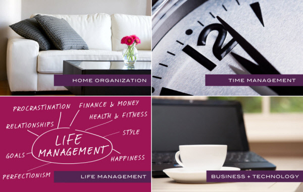
I’ve now simplified the site into 4 areas:
- Home Organization: decluttering, simplifying, and organizing your space
- Time Management: being more productive
- Life Management: relationships, happiness, perfectionism, goals, procrastination, style, health & fitness, and money & finance
- Business + Technology: being more successful at work and using tech tools.
There’s some overlap but they’re also each a distinct area of interest.
I’ve organized the blog and store around these 4 areas and even created a Start Here page for each one.
Plus I’ve streamlined and/or rearranged products, retired all the packs, and added a brand-new, super-simple Premium Subscription option for people who want the best value.
I’ve also refreshed the logo and design, and expanded my About page to include questions I’m often asked.
I hope you find everything cleaner, simpler, and more enjoyable to use.
What Do You Think?
Of course it’s not perfect, and I wish I’d had more time to get everything just so. Don’t we always feel this way?
But I set myself a deadline and, just like many of you, I fought the perfectionism monster to reach my goal: which was to go live by my birthday (Friday).
Over the next couple of weeks I’ll refine, and tweak, and generally be a nightmarish pain in the butt to my web guy. 🙂
I’ve put a lot into this project, and I would really love to hear what you think…
Welcome!


Hello Michele, the new design looks great, and is very easy to use. Thank you for this!
Thank YOU Cynthia for checking it out, and for your kind feedback. 🙂
Looking very smick 🙂 Well done!
I appreciate that Vicky. 🙂
Looks great! I love it.
Thanks so much Ciearra! 🙂
Wow it looks great. Very streamlined and I love the cute new logo 🙂
Thanks a bunch Lisa! I try to keep the site fun! 🙂
I’m new to your site and truly believe what is meant to be will take you down the appropriate path of life. You appeared on my Facebook page through one way or another. I have read a number of pieces on your site and was also pleased to see you are also in Australia 🙂 I have a strong feeling we will become good friends and one day I am absolutely certain we will meet. Fantastic work & I love your inspirational approach to life xxx Julie xxx
Hi there Julie. Thank you for visiting, and for your lovely comments!! ♡
I’ll keep an eye out for you, my fellow Aussie friend.
I love the new site…it’s easy to navigate through. I can see myself coming back often.
That’s wonderful Robin – I hope you do! 🙂
I love your new design. Keep up the good work Michele!
Thank you Terry! Will do. 🙂
Michele I love the new design, very clean and simple to navigate plus its in my favourite colour palette.
He he mine too! Thanks for your feedback. 🙂
I love the new look.
Thanks Chris!
It looks great Michelle 🙂 Love how you’ve categorised things! xxxx
Thanks Calendula – I appreciate your feedback! 🙂
Happy Birthday today, too 🙂 xxxxxxxxxxxxxxxxxxxxx
Thank you! I’ve had a FABULOUS day. 🙂
Following the recommendation of a friend, I started reading your blog 2 months ago. Some things were of more interest to me than others. Your “facelift” makes it much easier to focus on my interests/needs and follow threads. Thank you.
Glad to hear that Brenda – and I hope you keep reading! xx