On December 1 I’m releasing a very exciting new product called 52 Weight Loss Missions. I think this is my best product yet.
52 Weight Loss Missions: A Radically Different Approach
For most of us who struggle with weight loss, the problem isn’t what we don’t know, it’s what we don’t do.
This is where 52 Weight Loss Missions is unique. The program:
- Includes 52 action-based missions
- Focuses on actions that are smart and strategic
- Covers diet, exercise and mindset
- Helps you change the path of least resistance so eating, moving and thinking right get easier
- Draws on psychology and life coaching to help you win the mental battles
- Uses a range of cool tools to keep you committed and accountable
- Offers hundreds of practical ideas and strategies
- Is succinct and easy-to-read – 100% fluff-free
- Rewards you for taking action.
Which Logo Do You Like, And Why?
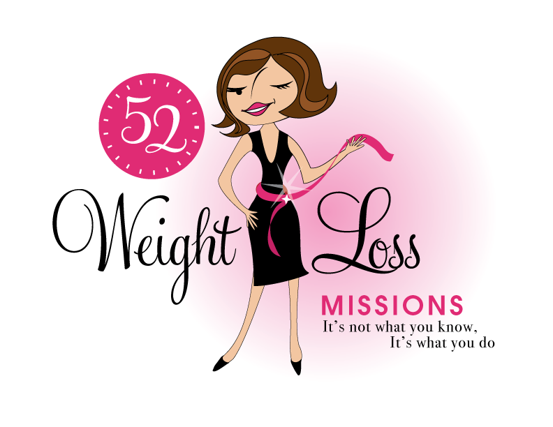
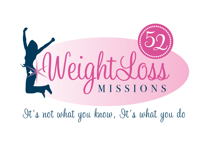
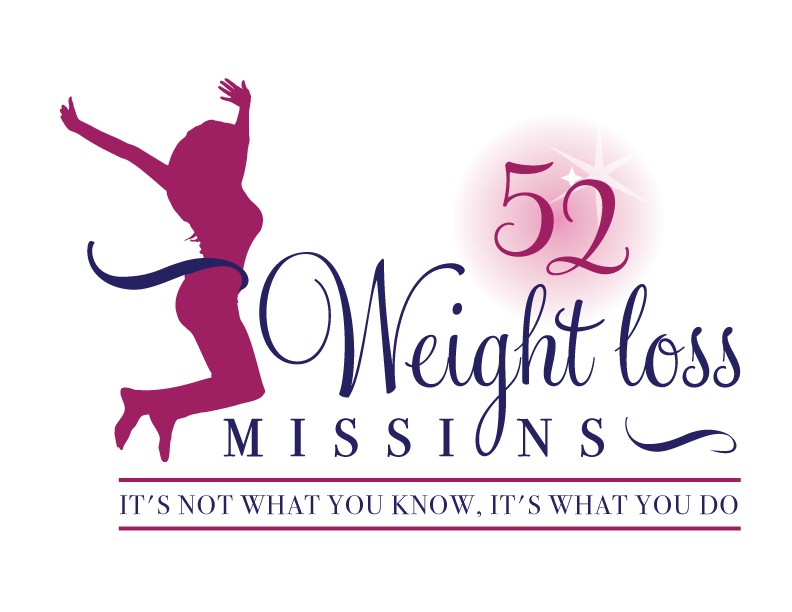
I have three potential logos for this new product – and I’d really appreciate your feedback on which one you like best, and why.
(By the way, the logos might seem a bit girly because my research tells me it’s mainly us girls who struggle with this stuff. But the program content is gender-neutral. And if you guys want one, Ill do a dude version just for you. :))
Logo 1

Logo 2
 Logo 3
 Cool Prizes
I’ll pick two commenters to receive a copy of the 52 Weight Loss Missions Action Pack as a prize. The Action Pack includes 52 Weight Loss Missions plus a range of interactive materials including a Workbook, Journal, and Planning Tools.
Want To Know More?
If you want to know more about 52 Weight Loss Missions:
I’ll let you know about special introductory offers and I’ll also announce the winners in both places.
Thank You!
I really appreciate your feedback. And good luck!
Leave a comment on this post to tell me which logo you like best, and why.

![BRAND NEW ‘52 Weight Loss Missions’ Logo Survey [I’d love your feedback! And there are cool prizes.] 1 Logo1 Logo1](https://www.getorganizedwizard.com/wp-content/uploads/2011/10/Logo1.png)
Hi…This is great….I like #3 the best…it is the most “modern” of all three, the shape and size of the woman is more normal…not model thin….but most of all….the motivator /saying is printed ..it really stands out as the first thing you see/connect with….
What a great idea for a program..thanks for sharing with us…
I like #1 – i love the way she is winking – she just looks a little mischievious – like “look at me – what I’ve accomplished – sexy!
Cant wait to start!
I like elements of all three but my favorite is #1. It is more appealing to the eye. In #2 the sprakle on her bottom pulls the eye away from the title and message. I like the sprakle on the “52” of number three and that the figure is facing the goal. I don’t like that the loop of the “G” is the “o” in mission. Doesn’t look right to my eye.
#1 is sassy and fun. She looks like “Hey look what I accomplished”. The logo is balanced and easy to read. Losing weight is not easy, but anything that makes it more fun is good. I like her.
I like number 3….more realistic and it seems to encourage me to FINALLY follow through!
I like # 3. # 1 is too girly, and way too skinny – too 50’s magaziney, except people weren’t that thin in the 50s. # 2 – too skinny, weird to have the star on her rear end. So #3. Looks real.
#3 because it’s realistic. I would love to look like #1, at least have that silhouette. That’s not realistic..
I’m drawn to both the first and third, but I like the first one the best cause it looks like I want to look someday! LOL I like the colors and the cute gal with a wink…totally me!
Number 3 is up-to-date, current and practical, so I really like logo 3.
However, logo 1 caught my attention because it takes me back to a time when we weren’t overweight in the way we are now. I think of the commercials for all these new food products on the old radio shows before TV. Perhaps they have led to this weight gain, but they were fun to listen to. And the TV shows, like Leave it to Beaver with Barbara Billingsley and the way a housewife and mother dressed to do her vacuuming while she wore her pearls. Just good memories of a peaceful family situation. Nothing like the hustle and bustle of today (the jumping action of the other two logos) where we have so much to do and it’s just busy-ness. We need to get back to relationships and time for ourselves and families. So, as not part of the youngest crowd reading your posts, as I am older, these are good memories.
They are all very crisp and clean and attractive, but I will have to go with the first one, it “grabs” my interest a little more than the other two.
I like #1 the best. It’s pretty and happy and makes me smile. :o)
Definately number three, classy and what you would want to aim for, number 2 doesn’t work and number one although fun isn’t really showing something to aim for. Number 3 makes you want that figure
I like No. 1. She’s happy she lost weight and happy about her gorgeous new figure after she finished your 52 Mission Weight Loss Program.
I like logo #1 best. The jumping women seem a bit cliche, and also I think it’s strange to have silhouettes, it makes it less personal and more generic. And I agree with previous posters that the cute first logo would pique my curiosity- I might cluck it just to see what it was.
I was drawn to logo #2 first, but also really like the spunk of the first one!
Definitely love #1 !! It’s inviting me to join the weight loss missions, it says we want to do this to feel good about ourselves, I like the wink.
I like logo #1 – it’s cute, fun and playful – it’s a little less generic. Good luck!
I like Logo #2, the figure looks the most realistic (and excited), the lines are clean and the colors are crisp and professional looking.
What a great idea! I can’t wait for December 1! :0)
My favorite logo is #3. It seems to have lots of movement and energy. Just what I need!
I think the logo #1 is absolutely fabulous! You use similar graphics all over your products, so I do believe that it will suit ’52 weight loss missions’ most. Also – lady on the picture is everything that all the fat chicks would love to be: stylish, sexy and happy!
I am sooo exited that you are going to release 52 weight loss missions! Excellent idea!
I like #1 best for it’s whimsy, followed by #2 for it’s appearance of victory. However, all three logos shout “female” program. If you want to target more men, I’d suggest adding a similar male silhouette to logo #2. Let them both jump for joy. 🙂
-Nan