On December 1 I’m releasing a very exciting new product called 52 Weight Loss Missions. I think this is my best product yet.
52 Weight Loss Missions: A Radically Different Approach
For most of us who struggle with weight loss, the problem isn’t what we don’t know, it’s what we don’t do.
This is where 52 Weight Loss Missions is unique. The program:
- Includes 52 action-based missions
- Focuses on actions that are smart and strategic
- Covers diet, exercise and mindset
- Helps you change the path of least resistance so eating, moving and thinking right get easier
- Draws on psychology and life coaching to help you win the mental battles
- Uses a range of cool tools to keep you committed and accountable
- Offers hundreds of practical ideas and strategies
- Is succinct and easy-to-read – 100% fluff-free
- Rewards you for taking action.
Which Logo Do You Like, And Why?
I have three potential logos for this new product – and I’d really appreciate your feedback on which one you like best, and why.
(By the way, the logos might seem a bit girly because my research tells me it’s mainly us girls who struggle with this stuff. But the program content is gender-neutral. And if you guys want one, Ill do a dude version just for you. :))
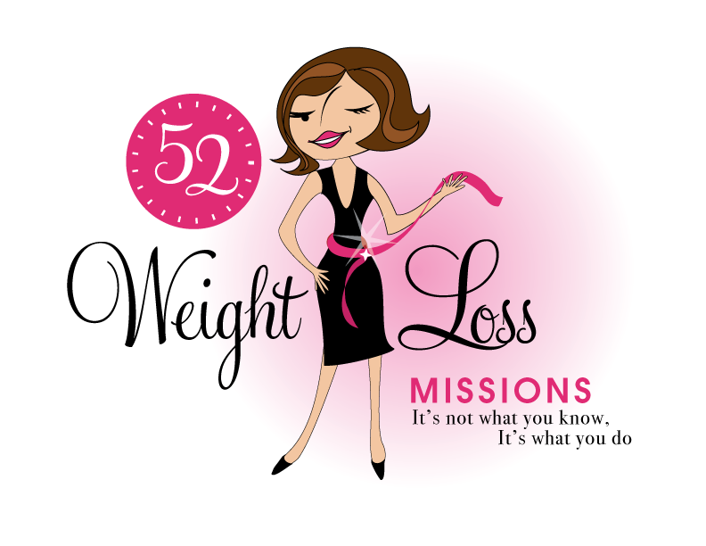
Logo 1

Logo 2
 Logo 3
 Cool Prizes
I’ll pick two commenters to receive a copy of the 52 Weight Loss Missions Action Pack as a prize. The Action Pack includes 52 Weight Loss Missions plus a range of interactive materials including a Workbook, Journal, and Planning Tools.
Want To Know More?
If you want to know more about 52 Weight Loss Missions:
I’ll let you know about special introductory offers and I’ll also announce the winners in both places.
Thank You!
I really appreciate your feedback. And good luck!
Leave a comment on this post to tell me which logo you like best, and why.

![BRAND NEW ‘52 Weight Loss Missions’ Logo Survey [I’d love your feedback! And there are cool prizes.] 1 Logo1 Logo1](https://www.getorganizedwizard.com/wp-content/uploads/2011/10/Logo1.png)
Love Number 1, it looks fun, easy, glamorous…
i like option #1. The brighter colors catch my attention, the artwork is catchy and fun. Personally, while I know losing weight is hard work and a very serious matter, a “serious” logo wouldn’t draw me in. This one keeps it light and makes it seem achievable. Also, the wording flows better from left to right. So, option #1, for sure. Thanks! Erika
I love the 1st logo! The woman in the logo is stylin’ and best of all, she isn’t jumping in the air!
I like logo #1 beause:
-it has the “little black dress” look people relate to when setting weight loss goals.
-the pink belt ribbon represents a weight loss tape
-The 52 is a great logo branding of your company
-the lady winking gives the program a sense of fun and exciting
-colors used are appealing to the ad
-text and fonts used are perfect
Overall a really cute way to market your weight loss mission product!
Congrats!
I like Logo #1…I find the cute cartoon like character to be the most likeable and friendly…I would be most likely to click on this logo than any of the others.
I like #4 because it looks like a real, healthy woman. I know the #1 is a cartoon, but she still has a ridiculously small waist. And I don’t like the star on #2’s butt. Don’t we obsess over our butts enough as it is? 😉
#1
I can’t give you any good technical reasons, I’m just more drawn to it than the others.
Absolutely LOVE #3. Gives me a sense of hope and VICTORY! All three are very creative but #3 is my favorite 🙂
YES!!! I’m so excited for this!
I feel like #1 is the most consistent with your brand.
I like #3. It doesnt reveal a face/personality, so it could be any one of us. The excitement in the sillouette is meaningful and goes well with the directionality of the lettering.
I like the first logo! It’s cute, stylish and the colors are great. I love how she’s winking, like she knows exactly what to do to reach your goals. I don’t care for the silhouette of a girl jumping like in logos 2 and 3….seems too cheesy. I get the message of being excited about meeting a goal, but it’s hokey.
Can’t wait to see what you’re unveiling!
Like #3, very high spirit and feeling of lightness
LOGO #1 ~ love, love, love! It has everything needed…fun, hip & styling…and it tells you how long the program is, let’s you see the results you are aiming towards AND gives you the key to success, “It’s not what you know; it’s what you DO.” The wink adds to the fact that we all think there is a weight loss secret, but we all know that time and effort are involved. The sparkle on the ribbon and the smile on her face lets you know that the effort was worth it!!!
Can’t wait for the release…I think you’re right, this could be your BEST product yet! Congratulations!!!
Logo number one is the best. The woman has a face to go with the body. We are each so much more than our bodies. Her face, especially the wink, gives her a personality. The others are outlines, shadows, insubstantial. Besides, I can’t jump like those other two logo ladies! 😉
Well put my vote down for image #1! I am a very “visual” person….and many of my decisions on what to buy are influenced by that, consciously and/or unconsciously. The first logo is so much more fitting to the other products offered from you- she fits right in! Plus, she not only looks slim, she looks smart and sassy! The other two images remind me too much of all of the “grind” involved with weight loss- they seem to depict an element of “exercising” or at least “physical fitness”- plus, they seem to more emulate the visual themes offered by others trying to sell weight loss advice/messages. When I try to lose weight, yes…I have the goal of being physically fit there at the base of my reason for doing so….but it is the “I will look better” that really dominates my motives, whether I refuse to acknowledge that or not. The first image is immediately eye-catching- the others? Not so much. There you have it….my vote! Good luck!
I like #3. The first two are way too girly. I would like to see something with more substance. I feel they are all really too frilly.
#1 because it is the most oriented to weight loss, with the goal of the little black dress. Love the pink ribbon tape measure, star glowing, and pink and black coloring. Very chic! I agree completely with the other comments that #1 is the most “Michelle”. I am particularly attracted to your products for their cute factor and your “try it, it’s not as hard as you might think; you can do it!” messages. I want to lose weight and will buy this product, but would love to win it instead! 😉
I like #2 the best. The writing on that one seems to jump out a little better than the other two, and I like the person on that one the best. The first one seems extra skinny, and it shouldn’t be as much about skinny as it is being healthy. The third one just didn’t appeal to me as much because of the large front and back end.
My vote is for logo #2. It seems to represent ‘weight loss” as the main point of the program better than the other logos. Reading the other comments it seems like the majority are voting for #1. Although the cartoon like character is cute, I’m not sure I relate the logo to weight loss.
I was drawn to #1. It is attractive while the other two are more bland and clip arty.