On December 1 I’m releasing a very exciting new product called 52 Weight Loss Missions. I think this is my best product yet.
52 Weight Loss Missions: A Radically Different Approach
For most of us who struggle with weight loss, the problem isn’t what we don’t know, it’s what we don’t do.
This is where 52 Weight Loss Missions is unique. The program:
- Includes 52 action-based missions
- Focuses on actions that are smart and strategic
- Covers diet, exercise and mindset
- Helps you change the path of least resistance so eating, moving and thinking right get easier
- Draws on psychology and life coaching to help you win the mental battles
- Uses a range of cool tools to keep you committed and accountable
- Offers hundreds of practical ideas and strategies
- Is succinct and easy-to-read – 100% fluff-free
- Rewards you for taking action.
Which Logo Do You Like, And Why?
I have three potential logos for this new product – and I’d really appreciate your feedback on which one you like best, and why.
(By the way, the logos might seem a bit girly because my research tells me it’s mainly us girls who struggle with this stuff. But the program content is gender-neutral. And if you guys want one, Ill do a dude version just for you. :))
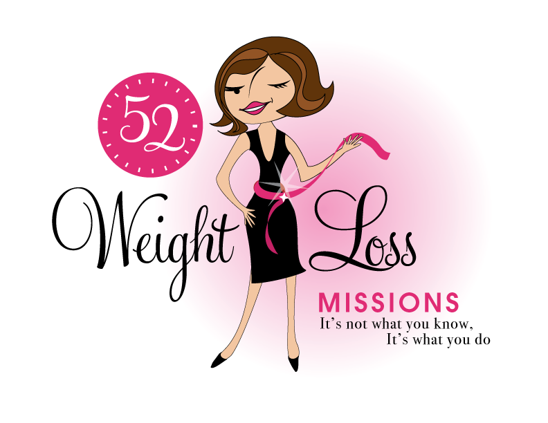
Logo 1

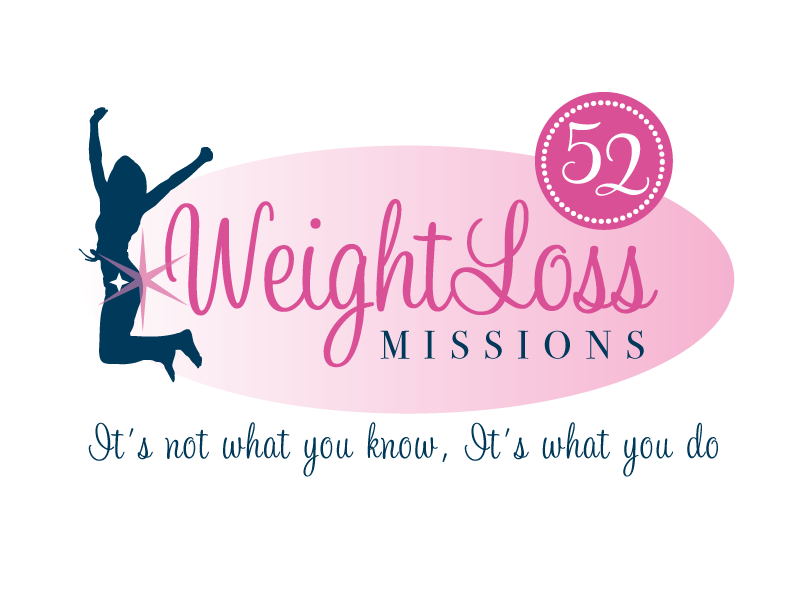
Logo 2
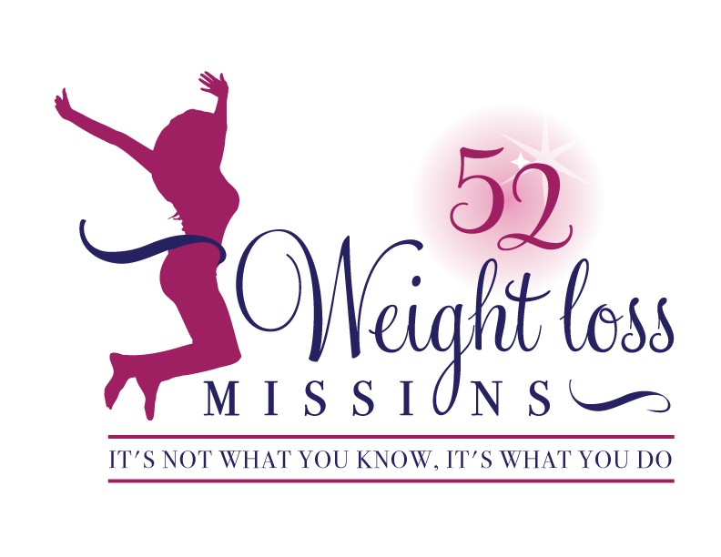
 Logo 3
 Cool Prizes
I’ll pick two commenters to receive a copy of the 52 Weight Loss Missions Action Pack as a prize. The Action Pack includes 52 Weight Loss Missions plus a range of interactive materials including a Workbook, Journal, and Planning Tools.
Want To Know More?
If you want to know more about 52 Weight Loss Missions:
I’ll let you know about special introductory offers and I’ll also announce the winners in both places.
Thank You!
I really appreciate your feedback. And good luck!
Leave a comment on this post to tell me which logo you like best, and why.

![BRAND NEW ‘52 Weight Loss Missions’ Logo Survey [I’d love your feedback! And there are cool prizes.] 1 Logo1 Logo1](https://www.getorganizedwizard.com/wp-content/uploads/2011/10/Logo1.png)
I like #2 the best. It’s more modern and I love the font.
The 1st one seems a little more personal to me. She has a face. I like #1 best.
What a great concept – I am looking forward to learning all about this product!
I like Logo 2 the best! The colors and font caught my eye and I love how the star on the woman shows how important she is. It is classy, serious and well put together.
I find #1 too whimsical and her waist is way too small. On #3 , the woman’s posture almost looks like she;s jumping into a pool and the 52 is also the only thing highlighted.
I like #1!
oh, number 1 for sure!
the others made me feel guilty somehow…overly sporty and made me feel inadequate already! Number 1 had some fun and no judgement about it!
I like number 1 the best. I need a face to connect with the woman. The jumping women don’t make me connect with them as a person. The first figure is a cartoon caricature so I don’t feel like her thin size is problem but maybe it could be adjusted to make her not so tiny. I think this sounds like a great product. I work hard at maintaining a healthy weight and try to tell people that it’s a way of life and not something you do for a period of time then stop. I’m sure certain Michelle will put out a product that will give results.
I like Logo # 3. The reason being – the figure is facing the 52 Missions. No.3 looks more positive than the other two logos. It looks like the woman in the picture wants to loose weight and attempting the 52 Missions will free of her weight problem. Therefore # 3 is more appealing from all aspects. Iwish you success like all your previous endeavours. God Bless!
They are all quite nice, but I like number 3 the best. It is ethnicity neutral. The woman is facing the “challenges” rather than away from them as in logo #2. Also, the motto, “It’s not what you know …..” is in an easily read and large font. The sparkle behind the number 52 implies something positive rather than the opposite.
I really like Logo #1. I take it that you are targeting the ladies. That one really caught my eye.
# 1 is the best the girl in the little black dress. Everyone wants to get into that little black dress. She looks happy has a face as the others do not.
I also like how the weight loss words are more of a curvy style and the rest are more plain text. The colors in this one along with the style of the words I feel is very eye catching and fun looking the tape measure around her is a very cute touch. I did not have to think twice about witch one I liked and I am also overweight by alot and this girl has a look that is appealing and fun looking to me.
I would actually like the image in number one, if it had a body more similar and real-looking, like the one in numbr three. The number three body seems too young for many of us.
i like logo 2.
It is simple and I like the person is jumping for joy, like new found freedom
I like #3 it’s not race specific and not too thin looking. Not everyone who is going to loose the weight and look like #1. When I personally started to losoe weight it was intimidating to see pictures of the “skinny people” all the time! Until I came across a group that had before and after pictures to show! Not everyone was super skinny, but all had lost weight! Realisticly in life not everyone looks like or will look like a super model!
I like #3 the best! The woman has a “real” figure that those of us struggling with the “battle of the bulge” can relate to, and her jump looks victorious, like she is being successful. Love the colors too! Can’t wait for you to release your program! 🙂
#1 – modern, flirty and attention getting – very fitting
I prefer logo #3 for the overall feel of it.
I like Logo 3. It’s bold and stands out there without the feminine association, which I think would make it easier to get my husband to do it with me. It just jumped out at me on the page, got my attention more than the other 2.
No 1 makes it look like fun,
The charachter has unique appeal,
unlike a slim models silhouette she reminds of someone that’s real.
The other 2 look much like every other weightloss advert aimed at me & you,
No 1 stands out, it’s different suggesting this product’s fresh and new!
Logo # 1. It matches the logos in the other GOW products. And it’s cute 🙂
Number 1 is the very best. The other 2 look like dance studio logos. The first one is mature, and I identify with the professional looking woman, looks like a working mom with determination. The others don’t have faces to identify with and look like dance or workout generic logos. I’m very excitied to hear more about your program!