On December 1 I’m releasing a very exciting new product called 52 Weight Loss Missions. I think this is my best product yet.
52 Weight Loss Missions: A Radically Different Approach
For most of us who struggle with weight loss, the problem isn’t what we don’t know, it’s what we don’t do.
This is where 52 Weight Loss Missions is unique. The program:
- Includes 52 action-based missions
- Focuses on actions that are smart and strategic
- Covers diet, exercise and mindset
- Helps you change the path of least resistance so eating, moving and thinking right get easier
- Draws on psychology and life coaching to help you win the mental battles
- Uses a range of cool tools to keep you committed and accountable
- Offers hundreds of practical ideas and strategies
- Is succinct and easy-to-read – 100% fluff-free
- Rewards you for taking action.
Which Logo Do You Like, And Why?
I have three potential logos for this new product – and I’d really appreciate your feedback on which one you like best, and why.
(By the way, the logos might seem a bit girly because my research tells me it’s mainly us girls who struggle with this stuff. But the program content is gender-neutral. And if you guys want one, Ill do a dude version just for you. :))
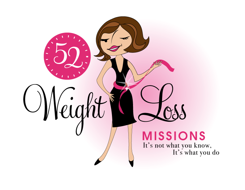
Logo 1

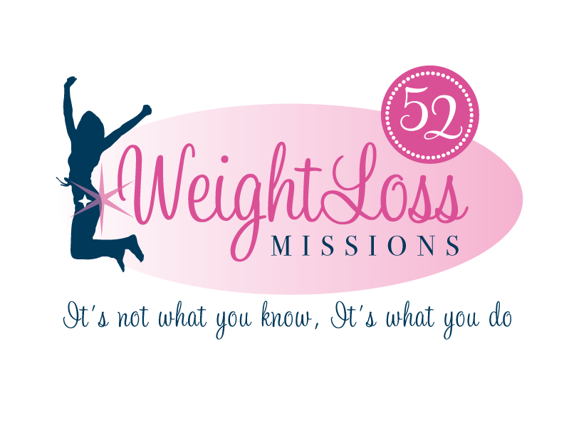
Logo 2
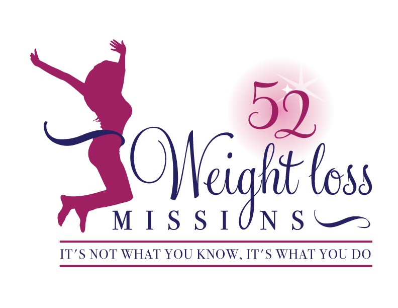
 Logo 3
 Cool Prizes
I’ll pick two commenters to receive a copy of the 52 Weight Loss Missions Action Pack as a prize. The Action Pack includes 52 Weight Loss Missions plus a range of interactive materials including a Workbook, Journal, and Planning Tools.
Want To Know More?
If you want to know more about 52 Weight Loss Missions:
I’ll let you know about special introductory offers and I’ll also announce the winners in both places.
Thank You!
I really appreciate your feedback. And good luck!
Leave a comment on this post to tell me which logo you like best, and why.

![BRAND NEW ‘52 Weight Loss Missions’ Logo Survey [I’d love your feedback! And there are cool prizes.] 1 Logo1 Logo1](https://www.getorganizedwizard.com/wp-content/uploads/2011/10/Logo1.png)
I like number 1 the best!
I like Logo #3. The silhouette shows a healthy woman of indeterminate race and the ribbon gives the appearance of crossing a finish line victoriously.
I find #1 a total turnoff– she is unnaturally thin at the waist and too cartoonish. The second one is my favorite– by showing a natural-looking silhouette, any person can see themselves in it, whereas the cartoon one limits you by race and body type.
#3 is also good, but I like the scale of #2 better, and I’m not crazy about the bowl of the “g” being the “O” of “missions”. #3 is just too busy, has too much going on.
I really like logo number 1. My only issue with it is how skinny the cartoon person is. When looking to motivate people to a healthy lifestyle I believe even the logo should depict a healthy size person.
The other 2 logos showed ladies of better size, but the other elements were not as fun and exciting. So, overall I choose number 1.
Number 1
I like #1. It’s retro, cute and fun. 2 & 3 are nice logos, but number 1 really speaks to me as a real person behind the logo; it’s not just some other company. Also, the “52” aspect of the logo reminds me of clock, indicating a “Timely” goal (T in SMART goals).
Thanks for all of your blogs, tips, and articles. They keep me inspired!
I think the first one best matches the energy of this site. She looks like a woman who has her stuff together and would make it happen. I suspect that may be why consciously or subconsciously it was presented first 😉
I actually really like the second one too, because the figure seems really excited and you can’t help but get the same level of excitement, though I have mixed feelings about the double star on the figure. I also think the color balance in logo #2 is much stronger than #3, as number three would probably get lost in this website, since the main figure is very similarly colored to your website background.
Additionally logo #3, reminds me more of an exercise bootcamp, because of the cute little ribbon that she has flying around her waist.
All of them overall are adorable, however, as they all have a both professional aesthetic. Some of the font choices have a classic retro vibe, particularly combined with the stars and color choices, which evokes the bewitched, i dream of jeannie time period.
I do definitely think you should have a male logo as well, if you will have separate entry points for men, particularly because you said the information is gender neutral :).
#3 is my favorite. I liked #2 also, but the silhouette in #3 looks more like a real, healthy woman and not an anorexic woman. Sounds exciting!
I prefer the first one because the style is more in keeping with what you’ve used previously, especially on the cover and promotional page for your Life and Goal Organizer. The only things that distract are the sort of odd line that represents the woman’s nose and the fact that she’s winking. The wink send a subliminal message that she’s pulling our legs.
I don’t think the other two logos would inspire me to look into the product any further.
Thanks for your newsletters.
Logo #3
I like number one best. It would attract my attention on a shelf. I like the sexy looking woman and I want to BE her!
I like #1. And I like the idea to make the skin a little darker. 🙂 ~Michelle
I like #1. Seems more exciting. With the wink, the hand on the hip and the little black dress I think she looks cheeky and fun. Even though she is cartoony I feel like I can relate to her. 🙂
With the other two, I keep thinking of toyota ads.
I like number 1 the best. The only thing I would change is to make her skin a darker shade of brown/tan so it would be more racially diverse.
I like #2, it really caught my eye. The colors are good, the message is there and it is enough to get someone excited.
I like #3 best. The person is the most realistic looking. I find that #1 catches the eye, but the Barbie like figure is troublesome. I think a positive image is important.
I like the first one. The winking woman makes it seem like the missions will be more fun and not boring. I don’t like that the 2nd “It’s” is capitalized though. The other logos are very generic with and I wouldn’t pay much attention to them.
I like #3, can be read at a glance, realistic figure, I just like it better. I wish you success in this and success to all your clients : )
I love logo #2. It doesn’t seem to focus on any 1 attribute. This logo to me represents a woman who is reaching the goals she desires for herself.
PS remember your consumer target: simplicity within sophistication is where you’re aiming, in selling them your ‘solution’ 😉