On December 1 I’m releasing a very exciting new product called 52 Weight Loss Missions. I think this is my best product yet.
52 Weight Loss Missions: A Radically Different Approach
For most of us who struggle with weight loss, the problem isn’t what we don’t know, it’s what we don’t do.
This is where 52 Weight Loss Missions is unique. The program:
- Includes 52 action-based missions
- Focuses on actions that are smart and strategic
- Covers diet, exercise and mindset
- Helps you change the path of least resistance so eating, moving and thinking right get easier
- Draws on psychology and life coaching to help you win the mental battles
- Uses a range of cool tools to keep you committed and accountable
- Offers hundreds of practical ideas and strategies
- Is succinct and easy-to-read – 100% fluff-free
- Rewards you for taking action.
Which Logo Do You Like, And Why?
I have three potential logos for this new product – and I’d really appreciate your feedback on which one you like best, and why.
(By the way, the logos might seem a bit girly because my research tells me it’s mainly us girls who struggle with this stuff. But the program content is gender-neutral. And if you guys want one, Ill do a dude version just for you. :))
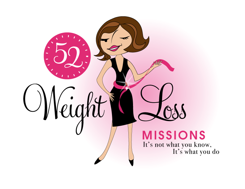
Logo 1

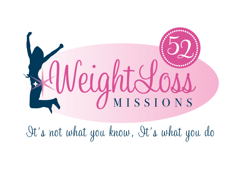
Logo 2
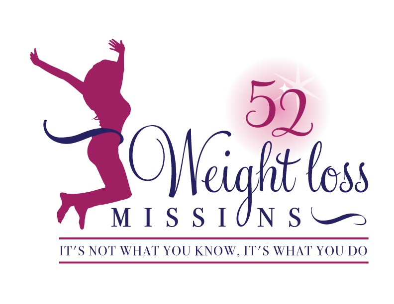
 Logo 3
 Cool Prizes
I’ll pick two commenters to receive a copy of the 52 Weight Loss Missions Action Pack as a prize. The Action Pack includes 52 Weight Loss Missions plus a range of interactive materials including a Workbook, Journal, and Planning Tools.
Want To Know More?
If you want to know more about 52 Weight Loss Missions:
I’ll let you know about special introductory offers and I’ll also announce the winners in both places.
Thank You!
I really appreciate your feedback. And good luck!
Leave a comment on this post to tell me which logo you like best, and why.

![BRAND NEW ‘52 Weight Loss Missions’ Logo Survey [I’d love your feedback! And there are cool prizes.] 1 Logo1 Logo1](https://www.getorganizedwizard.com/wp-content/uploads/2011/10/Logo1.png)
I love #1. It’s has a classic look to it. The other two are really nice but I like that #1 has a face to her. She isn’t some random person. I think people can identify better if they see a person and not just a silhouette.
Number one is very eye catching and would tempt me to check out the product so it is my favorite!
I like number 1.
I love having a face to look at! Plus she looks fun, flirty, cute, etc…
The ribbon around the waist & the wink is the “icing on the cake”
I like Logo 1 the best.
I like logo nr. 2.
I like number 1 as well. It’s easy to read and follow. The girl is adorable and it’s fun to look at.
I like number 1 – she is we ring a little boack dress, which is something i pan to buy when I reach my goal lol
Number 1 catches my eye and makes me want to inquire about what the 52 missions are. And you have hit the nail on the head, we do know, we just don’t do. Can’t wait for the release!
I like elements of each logo but I would probably pick #2. I like the image in #2 the best because it represents to me someone “jumping for joy” after a big accomplishment or victory. I actually like the font in #1 better than #2. I think the font in #1 is clearer and easier to read. Thanks!
I like logo 1. It made me think about how I want to look someday.
I like #3! It’s girly, but it’s clean. Love the colors too!
Well, in the end I would go for logo 3…although I love logo 1, too. Logo 3 shows a person who is free and has a more normal body shape…although, you could make her look just that teenywheeny bit more like all of us, who are looking forward to your new challenge 🙂
Let us know and keep shining !
Best,
Eva
I like number 2 best. Its cleanest and I like the spark. However ifyou were to change something on it I would put the 52 on the left a bit more
I like #1 the best because she has more personality and sass then the silhouette ones.
I like #3 the best. It’s clean & her jumping up in the air gives the impression of her “freeing” herself.
I like logo 1 the best. She has the nostalgia feel of the 50s when life was a whole lot simpler.
Logos 2 and 3 are nice but a little more generic feeling to me.
I don’t want to be able to look slim and posed-perfect jumping in the air…I just want to feel good about myself in a “little” black dress! I also really like the fact that there is no scale which equals stress to lots of ladies. The tape measure shows that you’re accountable and recording your steps to success 🙂 She looks happy with her hand on her hips!
I prefer logo 1: it’s more pleasent, simpathetic. I like the comics!
Logo 2.
I do not like logo 1, with that skinny girl.
Logo 2 is perfect
logo 3 is just too busy.
So either logo 2 or 3.
I do not know that this survey will help you with so many liking each logo I look forward to seeing your choice.
I love your first logo.!!!! It’s more personal than the other two. It’s a logo that draws you in and makes you want to see what she knows that you don’t.
#1 The look of #1 caught my attention.