On December 1 I’m releasing a very exciting new product called 52 Weight Loss Missions. I think this is my best product yet.
52 Weight Loss Missions: A Radically Different Approach
For most of us who struggle with weight loss, the problem isn’t what we don’t know, it’s what we don’t do.
This is where 52 Weight Loss Missions is unique. The program:
- Includes 52 action-based missions
- Focuses on actions that are smart and strategic
- Covers diet, exercise and mindset
- Helps you change the path of least resistance so eating, moving and thinking right get easier
- Draws on psychology and life coaching to help you win the mental battles
- Uses a range of cool tools to keep you committed and accountable
- Offers hundreds of practical ideas and strategies
- Is succinct and easy-to-read – 100% fluff-free
- Rewards you for taking action.
Which Logo Do You Like, And Why?
I have three potential logos for this new product – and I’d really appreciate your feedback on which one you like best, and why.
(By the way, the logos might seem a bit girly because my research tells me it’s mainly us girls who struggle with this stuff. But the program content is gender-neutral. And if you guys want one, Ill do a dude version just for you. :))
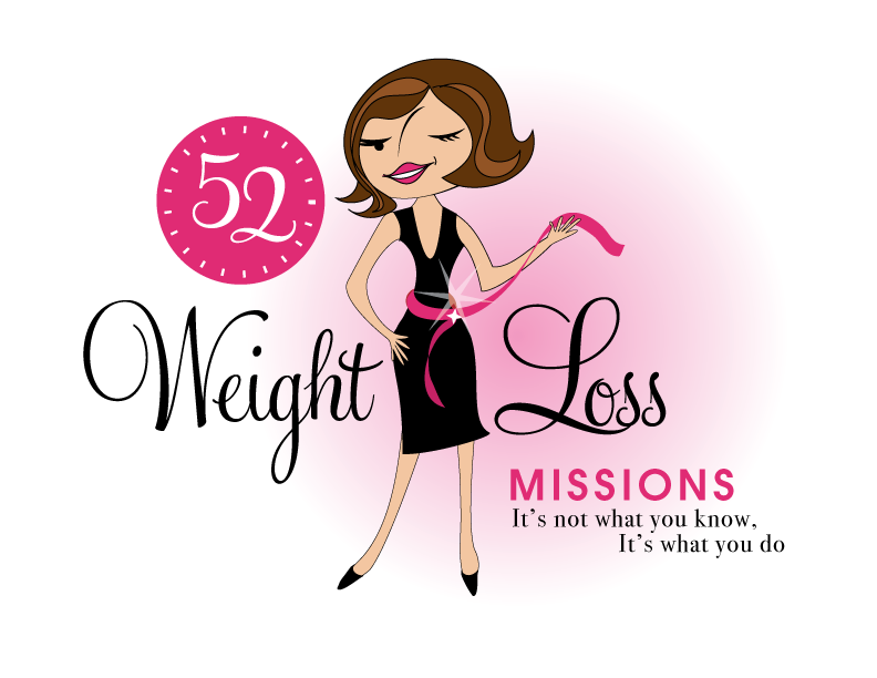
Logo 1

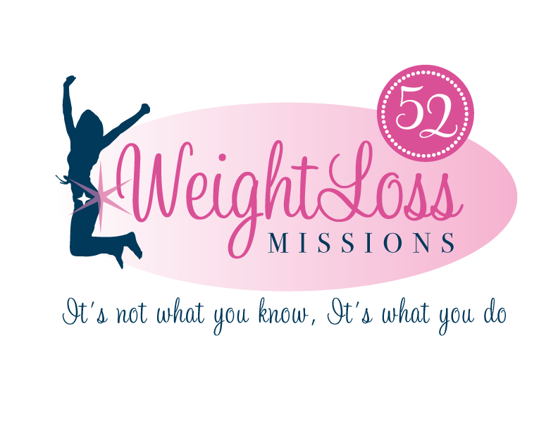
Logo 2
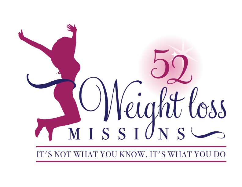
 Logo 3
 Cool Prizes
I’ll pick two commenters to receive a copy of the 52 Weight Loss Missions Action Pack as a prize. The Action Pack includes 52 Weight Loss Missions plus a range of interactive materials including a Workbook, Journal, and Planning Tools.
Want To Know More?
If you want to know more about 52 Weight Loss Missions:
I’ll let you know about special introductory offers and I’ll also announce the winners in both places.
Thank You!
I really appreciate your feedback. And good luck!
Leave a comment on this post to tell me which logo you like best, and why.

![BRAND NEW ‘52 Weight Loss Missions’ Logo Survey [I’d love your feedback! And there are cool prizes.] 1 Logo1 Logo1](https://www.getorganizedwizard.com/wp-content/uploads/2011/10/Logo1.png)
Pingback: October 2011 Sponsor Spotlight : I'm an Organizing Junkie
For sure, Logo #3. The figure could be one who is starting her path to the goal OR who has reached her goal. She is facing the 52 weight loss missions with excitement! Also, the tag line within the lines gives the impression of being a motto or mantra rather than an afterthought! I can’t wait until the product rolls out. All the best!
I like logo #2. The design is simply, but the silhouette shows victory is in your reach.
Thanks
The first one. i ti s personalised to you and no one can copy that look 🙂
I like #1 and #3. I like the cartoon female in the first and the real curves in the third. I found the lettering in the first to be more appealing. So #1 wins in my book.
It was a hard choice between 1 and 3…I saw #1 first – I loved the cuteness of it and it gave me a 50s, simplicity feeling! On #3 I liked the realistic body shape…so which to choose?? I guess as a business owner I would want people to be attracted to the product, seek to learn more…so #1 is my choice.
I guess I really don’t like any of them, but seeing that you are asking us to pick one, I would pick Logo 1. The problem with Logo 1 is that it is too 60’s. I am not a 60’s girl and find it hard to relate to. It reminds me of the style that would speak to my mother’s generation. The woman in Logo 1 is way too skinny and part of the problem we all have with not having the “perfect” Barbie body. The woman does not represent today’s woman at all. I definitely don’t like the star placement on Logo 2, although the woman is more representative of today’s woman. I like the tag line design in Logo 3 the best. Don’t like the stars, in general.
#3. The woman looks like she has reached her goal and crossed the finish line.
Logo #1. It’s fun, sassy, etc.
I don’t like the leaping woman in the other two logos. It is too similar to another logo I’ve seen in some other advertising – I just can’t put my finger on which product/place.
You definitely want your product to have its own identity!
I love logo 1.
Because it’s cartoonish it doesnt dictate what a woman *should* look like, which can be alienating if someone doesnt fit *the mould*… and the character looks cheeky and fun – a new approach to weigh loss – rather than drudgery and hard work which is usually associated with such a program.
Would love to know what the program entails!!!
I like #2 as it is positive and realistic – I think the women in the other 2 turn me off to it all as #1 has a tiny waist that would be staring back at me all the time and #3 has a profile that seems to be all about the boobs. I love the 52 missions idea and look froward to seeing it, but would want to see a healthy and realistic image to go with it.
I like logo #3 because the text is more noticable than the art. The other two have too much flair, in my opinion.
I prefer #1 its fresh, bright colors and new- feel like I’ve seen two and three somewhere or something similar before. #1 is personable, I like a face-people like to relate. She looks confident and successful, just look how how the measuring tape is! “lose weight mission” is kind of confusing as to what the program/logo is about , in a magazine I may skip over it, “Lose weight” around her makes it crystal clear what it is about. Hope you chose 1! 🙂
The first one is my favorite but I have serious issue with how the top half of the character looks anorexic from the hips up. To be honest with you, all three of the ladies in your examples look either already skinny or they look to be at a healthy weight. Perhaps, you mean for them to be a motivation…something for your buyers to aspire to?? I hate to be a downer, but you asked for our honest opinion. Otherwise they are lovely and #1’s colors and sharp lines/contrasts is my favorite.
Logo #1
I’m such a sucker for packaging and cuteness/coolness! And the first one is cute and grabs your attention, the others are a little to expected, i don’t know if that communicates it correctly but a person jumping up for victory or something, anyways, this book sounds super helpful and useful, good luck!
Number 1!! It looks Fresh
I like #1 – it’s fun and eye catching! 🙂
Logo #1 just grabs your attention and then allows you to read the message.
Definitely prefer the first logo. It’s striking, eye-catching, quirky, yet feminine and I love the wink! She knows the secret and we women love to know secrets, right? Besides, I’ve always had an affection for the “vintage” look.
I really like the first logo. The woman you have used has a sweet and girly look about her but not extremely sporting, which would make the average woman more interested in having a read.