On December 1 I’m releasing a very exciting new product called 52 Weight Loss Missions. I think this is my best product yet.
52 Weight Loss Missions: A Radically Different Approach
For most of us who struggle with weight loss, the problem isn’t what we don’t know, it’s what we don’t do.
This is where 52 Weight Loss Missions is unique. The program:
- Includes 52 action-based missions
- Focuses on actions that are smart and strategic
- Covers diet, exercise and mindset
- Helps you change the path of least resistance so eating, moving and thinking right get easier
- Draws on psychology and life coaching to help you win the mental battles
- Uses a range of cool tools to keep you committed and accountable
- Offers hundreds of practical ideas and strategies
- Is succinct and easy-to-read – 100% fluff-free
- Rewards you for taking action.
Which Logo Do You Like, And Why?
I have three potential logos for this new product – and I’d really appreciate your feedback on which one you like best, and why.
(By the way, the logos might seem a bit girly because my research tells me it’s mainly us girls who struggle with this stuff. But the program content is gender-neutral. And if you guys want one, Ill do a dude version just for you. :))
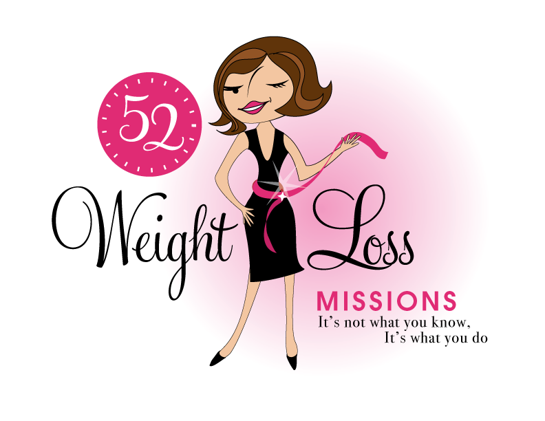
Logo 1

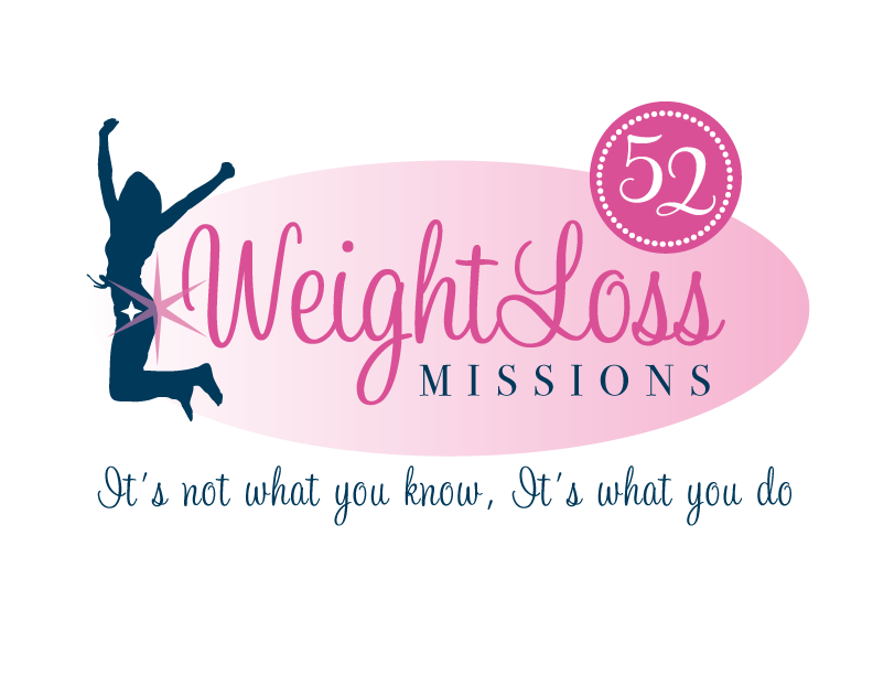
Logo 2
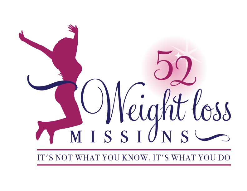
 Logo 3
 Cool Prizes
I’ll pick two commenters to receive a copy of the 52 Weight Loss Missions Action Pack as a prize. The Action Pack includes 52 Weight Loss Missions plus a range of interactive materials including a Workbook, Journal, and Planning Tools.
Want To Know More?
If you want to know more about 52 Weight Loss Missions:
I’ll let you know about special introductory offers and I’ll also announce the winners in both places.
Thank You!
I really appreciate your feedback. And good luck!
Leave a comment on this post to tell me which logo you like best, and why.

![BRAND NEW ‘52 Weight Loss Missions’ Logo Survey [I’d love your feedback! And there are cool prizes.] 1 Logo1 Logo1](https://www.getorganizedwizard.com/wp-content/uploads/2011/10/Logo1.png)
I like logo number one, because the emphasis is on the smile on her face and when you lose weight, you are happy because you feel better about yourself… inside and out. The other two emphasize the body too much.
#1 for sure!
#1 I think it catches the eye and also that every women wants to look in the mirror and have that attitude the cartoon has…..
I adore logo number 1. I think its the most modern.
Is this going to be a week-to-week email?
I’m desperately trying to lose weight and I would love to incorporate your ideas into my plan? Is there any way to buy the whole pckg now? I can’t wait.
So incredibly sorry abt the loss of your Dad.
I like number one. It’s more personable. It’s very cute and fun.
I like # 3 because the woman is curvy and not ethnically specific.
#1 is #1 i like it, it’s eye catching
I like logo #1 best! It is my favorite because of the colors, sassy look and because it looks fresh and inviting. It would motivate me more, make me think the program is fun, and I can look good while doing it. I completely agree that a “dude” logo is needed. 🙂 I can’t wait to learn more!
Love Logo 3. It shows the elation of the person who is reaching or nearing goal! What a successful program this portrays!
I like #1 It seems to draw my eye the most.
Hi Michele I like the one that is Unisex – it’s not here though.
I think men are battling with weightloss too – if you could add a silhouette of a man to #3 I would choose it.
I love #1. It’s retro, classy and still fun. The nose is a bit odd, but she looks sassy and determined. I like the “girlfriend” feeling, like she’s saying “We are in this together so let’s have some fun with it!” The other 2 seem more generic and a major turn off for someone not into exercise. They would serve better toward the end of the book when I have made peace with all the “have to’s” and am feeling more energetic about reaching my goal.
I like number 1 the best – stands out more than the others and looks a bit more retro.
Most balanced grafically and INSPIRATION is #1
but I HATE the face with the wink and dont like the nose or mouth either.
I like logo #2. It looks the most balanced. I also like the smaller woman because it makes it less focused on her and more on the messege of the product.
I like the colors in #1 best, but the girl in #3 the best.
Thanks for continuing to inspire.
I like #1. The design is clean, clear and attractive
I like number 1. It looks more personal. Like the colors and the message. The other two are too artsy. Not very inspiring to me.
My preference is Logo #3.
The figure is of a real woman
Love the color because it is bright & friendly.
Wishing you much success.
Thank you for being you.
I like #1 best – it makes it seem more real than just the silhouette’s 🙂