On December 1 I’m releasing a very exciting new product called 52 Weight Loss Missions. I think this is my best product yet.
52 Weight Loss Missions: A Radically Different Approach
For most of us who struggle with weight loss, the problem isn’t what we don’t know, it’s what we don’t do.
This is where 52 Weight Loss Missions is unique. The program:
- Includes 52 action-based missions
- Focuses on actions that are smart and strategic
- Covers diet, exercise and mindset
- Helps you change the path of least resistance so eating, moving and thinking right get easier
- Draws on psychology and life coaching to help you win the mental battles
- Uses a range of cool tools to keep you committed and accountable
- Offers hundreds of practical ideas and strategies
- Is succinct and easy-to-read – 100% fluff-free
- Rewards you for taking action.
Which Logo Do You Like, And Why?
I have three potential logos for this new product – and I’d really appreciate your feedback on which one you like best, and why.
(By the way, the logos might seem a bit girly because my research tells me it’s mainly us girls who struggle with this stuff. But the program content is gender-neutral. And if you guys want one, Ill do a dude version just for you. :))
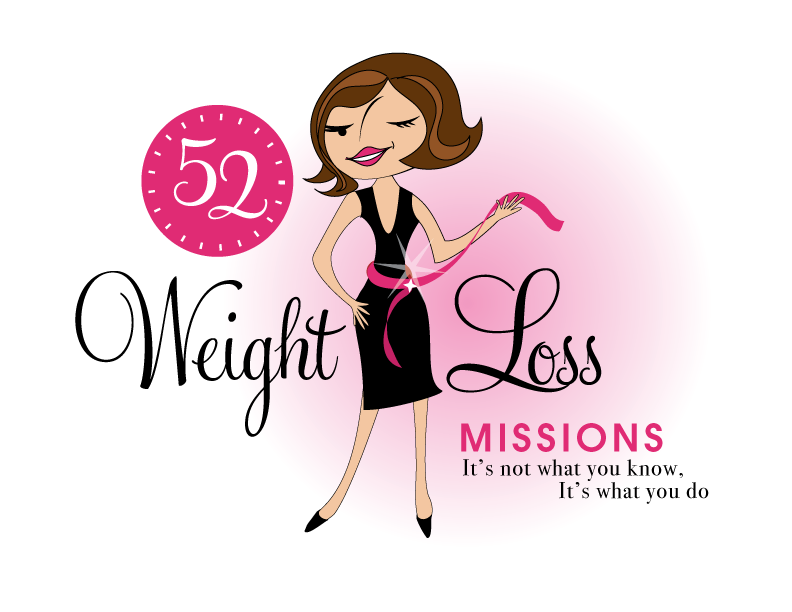
Logo 1

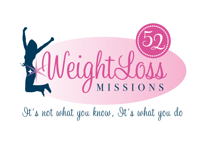
Logo 2
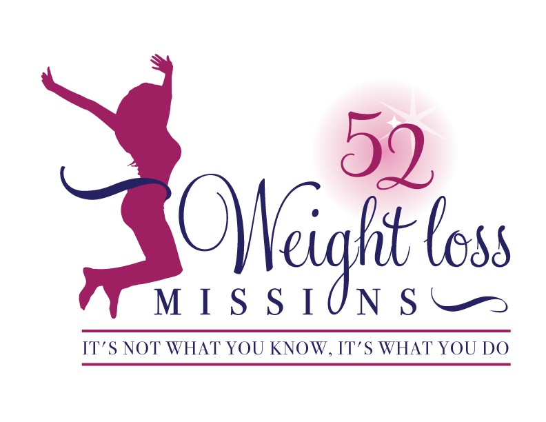
 Logo 3
 Cool Prizes
I’ll pick two commenters to receive a copy of the 52 Weight Loss Missions Action Pack as a prize. The Action Pack includes 52 Weight Loss Missions plus a range of interactive materials including a Workbook, Journal, and Planning Tools.
Want To Know More?
If you want to know more about 52 Weight Loss Missions:
I’ll let you know about special introductory offers and I’ll also announce the winners in both places.
Thank You!
I really appreciate your feedback. And good luck!
Leave a comment on this post to tell me which logo you like best, and why.

![BRAND NEW ‘52 Weight Loss Missions’ Logo Survey [I’d love your feedback! And there are cool prizes.] 1 Logo1 Logo1](https://www.getorganizedwizard.com/wp-content/uploads/2011/10/Logo1.png)
Love the first one – so CUTE and is consistent w/the avatar you’re already using. I think it’s important to relate branding so there is a cohesiveness. Now, just so you don’t think that’s the only reason I like #1, I really like it because it’s personable and friendly. She’s got a smirk on her face & seems sassy!
I feel No. 3 is more attractive and it definitely imparts a positive view. The print is concise and easy to read. Having the figure face the printing shows a celebration for the lettering and thus imparts a celebration for the reader who will enjoy reading the book.
I think #1 is eye catching. My son ,who is working on losing weight, likes # 2.
I like the retro look of logo #1.
I like Logo #1. I think it is flirty and fun.
Logo #3 is my second choice.
Logo #2 is not my cup of tea and seemed plain.
I like logo #1
I like Logo 3.
#One seems to be too chicky and too dated.
#Two reminds me of Weight Watchers Logo.
#3 is exciting and to the point with the fonts that are used!
I found logo one a dated figure,(reminiscent of 50s) and her face is sort of odd..the nose strangely placed,
The other two had real energy and appeal..but beware of getting “too busy” with too many things to look at.
There is a visual trick with marketing, where they say our eyes travel from left to right, so if you don’t want the eyes to keep going..and leave the logo, you need something on the right bringing them back to centre. eg if you took the third logo, which I think looks modern and energetic, put the jumping figure over on the right, and reversed, so she is looking back into the logo, I think that would have both dynamism and utilise the trick to keep the eyes coming back to the centre words, which is what you want. I would also take the star away from the 52..that particular star setup looks a tad religious..maybe move the 52 more to the left of the W if figure has been shifted, balance?
Just my thoughts.
Without a doubt…#1 (though I would definitely change her nose). Looks more professional than the others, which to me, also instantly boosts your credibility. She’s fun, flirty, love that even though she is thin, she still has bodacious curves. The fonts, colors, images all mesh well together as well as with your image.
The silhouettes in both #2 & #3 feel cold & cookie cutter-ish to me. The fonts don’t blend well. My eye is not drawn to anything particular. If I saw either one of them on their own, I wouldn’t automatically connect them to your organization, which I believe, is the whole purpose of a logo…instant recognition. They remind me of the logos I used to create when I first started my job 10 years ago.
#1. It’s fun, light-hearted and original. The others remind me of Women of Faith conferences.
I like the first one. It has personality.
I love #1. She’s sassy and shows confidence and has that “I CAN do anything” attitude.
Oh Yes, Number One without a doubt, It has a little bit of sass to it, the inner me I want to find again feel to it.
Two and Three are really good but for me and mission 52 I am looking forward to. (I turned 52 yesterday…)
Two and Three, I felt that they were leaning more to people who already go to the gym etc.
I guess I’m more of a ‘seasoned’ gal. Thanks for all you do.
I like #3 – the first one is a bit to girly for my taste and the second one jumps “out of the logo” – i like it better if the logo is a bit “closed” and clear. So #3 it is. Greetings from Germany!
I like logo #1 for its personality and “chic”” appearance! Look forward to this next project of yours!
I like the 1st one. It is more eye catching than the other
I like #1 the best because it is the most original. Numbers 2 & 3 both remind me of WeightWatchers and Jenny Craig because they look so corporate. And as a veteran of the weight wars, more corporate boring is not what I need. I like the stylish woman and love the way her clothes fit!
Personally I can’t wait to try the new product. It sounds very motivating.
Love the first one. Black and Pink are classy. The model is a great representative for all ages. I’m 60 years old and while my mind thinks my body can JUMP my body knows it cannot BUT I can look curvacious and svelte and classy. Logo number one has the most universal appeal — in my opinion. Love your site and thanks for your generosity.
I love logo #1 because it’s much more visually stimulating than the other two. Although the other two are also very good. The use of color and non silhouetted figure really keeps your attention. Plus, the lady seems cool and confident, which I think many of us aspire to be.
I like Logo #1. It’s eye-catching, playful, and it is just more pleasant to me.