On December 1 I’m releasing a very exciting new product called 52 Weight Loss Missions. I think this is my best product yet.
52 Weight Loss Missions: A Radically Different Approach
For most of us who struggle with weight loss, the problem isn’t what we don’t know, it’s what we don’t do.
This is where 52 Weight Loss Missions is unique. The program:
- Includes 52 action-based missions
- Focuses on actions that are smart and strategic
- Covers diet, exercise and mindset
- Helps you change the path of least resistance so eating, moving and thinking right get easier
- Draws on psychology and life coaching to help you win the mental battles
- Uses a range of cool tools to keep you committed and accountable
- Offers hundreds of practical ideas and strategies
- Is succinct and easy-to-read – 100% fluff-free
- Rewards you for taking action.
Which Logo Do You Like, And Why?
I have three potential logos for this new product – and I’d really appreciate your feedback on which one you like best, and why.
(By the way, the logos might seem a bit girly because my research tells me it’s mainly us girls who struggle with this stuff. But the program content is gender-neutral. And if you guys want one, Ill do a dude version just for you. :))
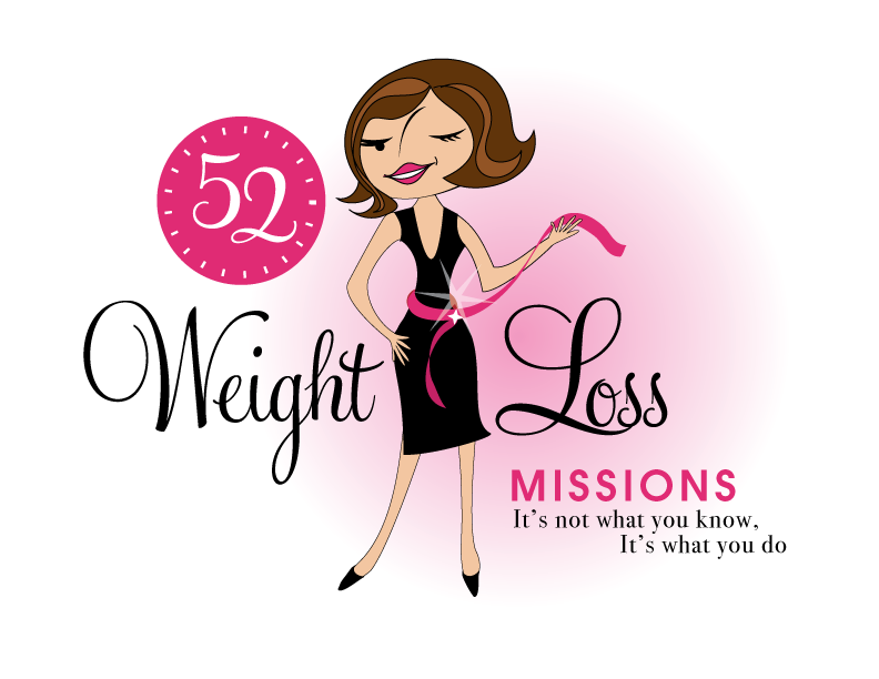
Logo 1

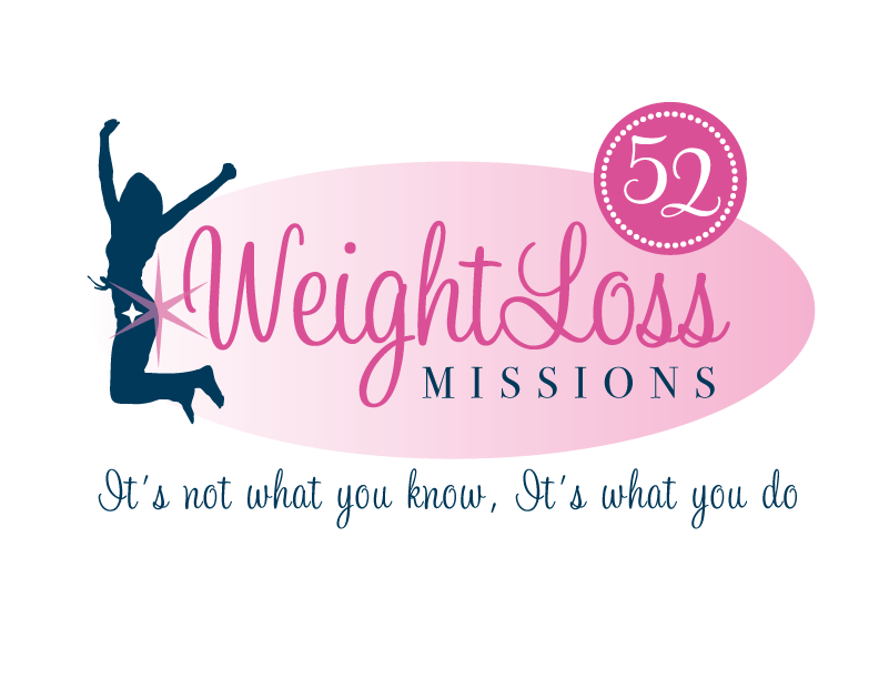
Logo 2
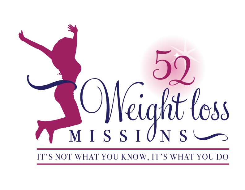
 Logo 3
 Cool Prizes
I’ll pick two commenters to receive a copy of the 52 Weight Loss Missions Action Pack as a prize. The Action Pack includes 52 Weight Loss Missions plus a range of interactive materials including a Workbook, Journal, and Planning Tools.
Want To Know More?
If you want to know more about 52 Weight Loss Missions:
I’ll let you know about special introductory offers and I’ll also announce the winners in both places.
Thank You!
I really appreciate your feedback. And good luck!
Leave a comment on this post to tell me which logo you like best, and why.

![BRAND NEW ‘52 Weight Loss Missions’ Logo Survey [I’d love your feedback! And there are cool prizes.] 1 Logo1 Logo1](https://www.getorganizedwizard.com/wp-content/uploads/2011/10/Logo1.png)
I perfer number 3 it draws to eye
Number 2 because it is the least obvious regarding gender. I think alot of men would be interested in your program also but it would be difficult to get my boyfriend to join me if he thought it was a girl thing exclusively.
I’d sign up to the first logo – it makes the process seem more ‘lighthearted’ – just like it is to identify, loose and control the ‘excess weight’ around the house. Thanks!
I like #1 the best. It is the most vibrant and colorful. The other 2 logos are more like a professional weight loss program looking to me. The first one is much more personal and inviting.
I like # 2 ~~It is uplifting and fun!! It feels inspirational
I like the first one because it is so fun and playful, and captures that goal of having a perfect little black dress! However, I’m not sure I like the ‘wink’. It’s cute, but it’s a little distracting. The other two logos kinda remind me a little too much of the silhouette stickers of strippers you see in truck windows and they give me the uncomfortable reminder of women being objectified rather than comfortable with themselves.
Looking forward to the plan! I’ve read so many books about weight loss, but you’re so right – it’s what I’m not DOING rather than what I don’t know that is holding me back!!
#3 because the figure isn’t as thin looking. Also the fact she is facing the words.
#1 may be a cartoon but I think the waist way to small.
I like number 1. So many sites already have us comparing ourselves to the “perfect” figure, but I can’t compare myself to the cartoon.
I don’t like any of them. They’re way too busy. The woman in #1 makes me want to smack her. The fonts are too cutesy for all three of them. If you’re going to have a tag line, make sure it’s grammatically correct. The second “it’s” should not be capitalized after a comma. It should only be capitalized after a period.
I like #1. It has a cute but clean look to it.
All seem very stereotypical, pink is not easy to find a good tone, #1: is reminiscent of the Stepford Wives. The wink is not useful and the line on the face is either a large nose or an odd hair out of place, smile is not friendly. The main message is surely the last line which is in smallest print.
#2 Faded pink and hand writing is often hard to read. Figure in black leads the eye away from the message she is facing away from the message, shades of fitness gym not necessarily weight loss . No light and shade in size of writing either.
#3 Clearer prefer the darker shades. However the use of the y as the o is actually confusing to the eye – print the message at the end too. I prefer the 52 without the clock face behind it. So #3 for me
I like number 1. The woman reminds me of you. She seems like a go getter in this logo. I like the color combination, too. Bright and crisp. They other two resemble other types of weight loss logos.
Good luck with this adventure. I am glad you are back in the “circuit” full steam.
I like number 3. It is the most professional look all around. In Number 1, something is off with the nose and eyes. Number 3 is my pick.
It’s a toss up…
#1 ~ Fits in with other products that use characters to represent categories so it is the BEST idea…. HOWEVER… I think it should be Michelle’s character instead of the one used which is 1) too skinny, 2) nose is odd, 3) wink isn’t clear so she just looks like she has a weird eye… LOGO line: the second should be centered under the first line.
#2 ~ Balanced and Clean… don’t get the star though.
#3 ~ NICE… balanced and sharp… I like the loop of the ‘g’ becoming the ‘o’ in missions… cute.
I love # 1. It’s super cute and I tend to like caricatures.
I like Logo #1! It’s modern, eye catching and most likely to pull me in and let me know that I too can lose weight if I put my mind to it. The whole design itself is proming to those wanting to lose weight. The lady is giving me “the wink” that let’s me know she has the secret of 52 Weight Loss Missions that she will let me in on so that I can achieve the same goal she did…the measurements I want for my body. The little sparkling star by her waist while she’s getting her measurement gives her that smirky smile…”Yes, I did it and so can you.”
Logo #1 definitely! It’s cute and fun. I don’t care for the silhouettes at all.
Number 1!!
It’s fun, the character fits well with many of your other products offered. Numbers 2 & 3 remind me too much of other weight loss program logos.
Bottom line for me – weight loss needs to have an element of fun as we are after all, in it for the long haul.
I love logo #1. It caught my eye and got my attention. I have tried so many different diets, I am excited to read your new ideas.
They’re all quite different which speaks worlds of your creativity. Now, I believe that a Logo speaks silently. The first logo says to me that the product doesn’t work and we are going for show to sell it. Also the writing at the bottom right seems to small.
The Second logo immediately draws your eye to the female figures back side which seems to be implying that this product will give you the same back side. Superficial and not very appealing. The Writing at the bottom is floating independantly of the rest of the image therefor seeming disconnected and lacking support.
I don’t quite like the 52 in the solid bubbles either it seems too harsh and kind of detached from the rest of the logo.
So I would have to say LOGO #3 looks most appealing because it has a balance, structure, and Simplicity to it. It looks sophisticated, professional, and elegant and it allows your eye to flow over the whole image. The 52 is not in a solid bubble which allows it to mess well with the rest of the logo. The image of the woman is wrapped in with the title so to peak which is fabulous because it allows for that flow and togetherness of the image. The only thing that could improve on this logo would be to make the ‘L’ in the word loss capitalized so as to up hold the importance of the loss of weight and so long as it wouldn’t throw off the asthetics of it all.
Logo #3 Absolutely Stunning. Says we’ve got it together and so can you through it’s silent confidence.