On December 1 I’m releasing a very exciting new product called 52 Weight Loss Missions. I think this is my best product yet.
52 Weight Loss Missions: A Radically Different Approach
For most of us who struggle with weight loss, the problem isn’t what we don’t know, it’s what we don’t do.
This is where 52 Weight Loss Missions is unique. The program:
- Includes 52 action-based missions
- Focuses on actions that are smart and strategic
- Covers diet, exercise and mindset
- Helps you change the path of least resistance so eating, moving and thinking right get easier
- Draws on psychology and life coaching to help you win the mental battles
- Uses a range of cool tools to keep you committed and accountable
- Offers hundreds of practical ideas and strategies
- Is succinct and easy-to-read – 100% fluff-free
- Rewards you for taking action.
Which Logo Do You Like, And Why?
I have three potential logos for this new product – and I’d really appreciate your feedback on which one you like best, and why.
(By the way, the logos might seem a bit girly because my research tells me it’s mainly us girls who struggle with this stuff. But the program content is gender-neutral. And if you guys want one, Ill do a dude version just for you. :))
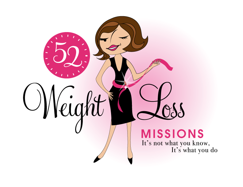
Logo 1

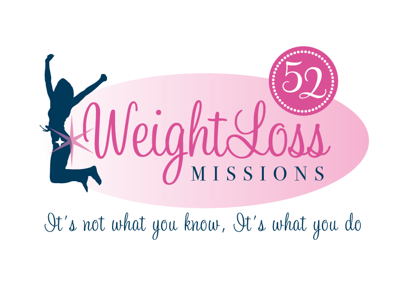
Logo 2
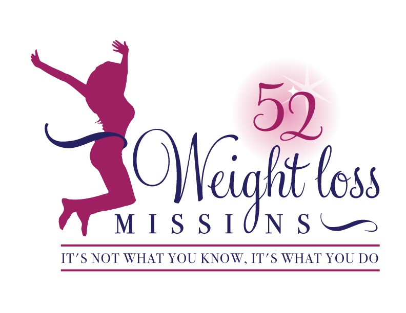
 Logo 3
 Cool Prizes
I’ll pick two commenters to receive a copy of the 52 Weight Loss Missions Action Pack as a prize. The Action Pack includes 52 Weight Loss Missions plus a range of interactive materials including a Workbook, Journal, and Planning Tools.
Want To Know More?
If you want to know more about 52 Weight Loss Missions:
I’ll let you know about special introductory offers and I’ll also announce the winners in both places.
Thank You!
I really appreciate your feedback. And good luck!
Leave a comment on this post to tell me which logo you like best, and why.

![BRAND NEW ‘52 Weight Loss Missions’ Logo Survey [I’d love your feedback! And there are cool prizes.] 1 Logo1 Logo1](https://www.getorganizedwizard.com/wp-content/uploads/2011/10/Logo1.png)
I like Logo #1 the best. She’s very curvy and friendly looking, in a healthy way. It’s the most personable of the three, and makes me want to see what she’s up to!!
Logo #1 is the best to me. It’s very chic and cute at the same time. The animated character adds youthfulness to it which is extremely appealing to all women. The confidence (and the bit of risque) added by the wink adds even more appeal. It’s fun, classy and definitely an eye catcher.
Logo # 1 is vibrant, fun, confident and a little flirtatious (with the wink) – just what every women aspires to be.
i like the first one b/c it looks more current. seeing the eyes of the gal draws me in, and i like the belt with the sparkle . . . which kind of signifies for me weight loss . . . waist reduction.
i dunno – the other 2 make me think of 80’s aerobics. i’ve been to places (old gyms, dance studios) where they had the silhouettes on the wall like that.
My vote is for Logo 3. For me, it delivers the message of exhiliration of conquering a battle we women fight, sometimes over and over. The figure of the women appears to be healthy, and because she’s shadowed, it could be me or any other woman. The fact that she’s facing the phrasing is also pleasing and friendly. Also like that 75% of the phrasing is “cleaner” in that it’s not clutter by additonal background colors. Wish you the best with this new venture and look forward to seeing more.
#1, I love the cartoon lady 🙂
looking forward to hearing more about this product!
I like #1. I liked that you can see her face and it looked more balanced. The others look to busy and squashed together. Trying to say to much in a small space. I know all of them say the same thing, but the style of the first one works best for me.
I choose #1 because I can see her face. She’s not hiding herself from anyone. I think a lot of us who struggle with our weight feel like hiding. Let’s not!
Logo 1 is a winner! It has a lot of pizzazz and grabbed my eye immediately. Love, love, love the wink and twinkle on her sasha! The marks around the “52” also seem to jump off the page and invite you in. The other two logos, while ok, do nothing to convey an energy I would like to see, and quite frankly need, from a weight loss book. Best of luck and I can’t wait to have your help in my weight loss for the new year!!
I prefer logo #2. I love the fun and playful nature of logo #1, but it has some strange body qualities that aren’t flattering or appealing. #2 looks clean and communicates well, with enough girliness to be appealing.
I would give anything to fit into my little black dress again someday…so #1 speaks in stereo to me! The other graphics make a good point, but are too generic. The first one looks like you in your photo on this site which makes the point that it is your program. I like the everything thing about #1!
I like the #1 lady and style. The 52 seems a little too prominent because of the “shine” lines though. I like that it looks like she is in the process rather than the others which are victorious. She looks like she wants to talk to us.
Just in case #2 is chosen, I would definately remove the large star because it looks like she either just got smacked or is making a noise…if you know what I mean.
I loe the first one… I never would jump like the others. They seem kinda fakey. Love the pink and black in all of them though.
I like #3
The woman that is portrayed looks more normal. Like we all are. She is plain, it could be anyone of us. I am overweight so the others just don’t do it for me like 3 does. It makes me want to see what your 52missions is maybe it has something that none of the other things I have tried had.
So thank you for trying this out and letting us help.
Logo 1 is inviting, intriguing and the whimsy of it makes you feel comfortable with getting involved. But the face bothers me a lot with the nose looking like a slash on her forehead… and one eye appears open and the other closed. Is she winking or is her face hurt? Logos 2 and 3 are well done for their style and I can see why people are attracted to them. They are modern and familiar. But too familiar, too common. I have come to be drawn to things that are seasoned with humor and fun, especially for a quest of weightloss which is not typically a good time. Logo 1 looks like a good time. Im a personal trainer and Logo 1 would get more of my clients asking questions and wanting to get involved. Looking VERY forward to seeing what you have up your sleeve!!
I like Logo #2 however I believe that Logo #1 just seems like it belongs to you!
I like Logo 1. It’s so cute, fun and colorful! I agree with Jamie though, the nose line bothers me too and I know one of her eyes is winking but it looks weird. I think both eyes open would be better. I hope I didn’t offer too much of my opinion 🙂
I like number 3 the best it is less gender specific and has good pop visually
Logo 1 is my favorite! It has a “whimsical” look to it. Fun, deliciously colorful and catches the eye to want to know what it’s all about!
Logo 1 is my favourite. It looks sexy (in a good way!) and looks approachable. Looking forward to finding out more about the content! 🙂