On December 1 I’m releasing a very exciting new product called 52 Weight Loss Missions. I think this is my best product yet.
52 Weight Loss Missions: A Radically Different Approach
For most of us who struggle with weight loss, the problem isn’t what we don’t know, it’s what we don’t do.
This is where 52 Weight Loss Missions is unique. The program:
- Includes 52 action-based missions
- Focuses on actions that are smart and strategic
- Covers diet, exercise and mindset
- Helps you change the path of least resistance so eating, moving and thinking right get easier
- Draws on psychology and life coaching to help you win the mental battles
- Uses a range of cool tools to keep you committed and accountable
- Offers hundreds of practical ideas and strategies
- Is succinct and easy-to-read – 100% fluff-free
- Rewards you for taking action.
Which Logo Do You Like, And Why?
I have three potential logos for this new product – and I’d really appreciate your feedback on which one you like best, and why.
(By the way, the logos might seem a bit girly because my research tells me it’s mainly us girls who struggle with this stuff. But the program content is gender-neutral. And if you guys want one, Ill do a dude version just for you. :))
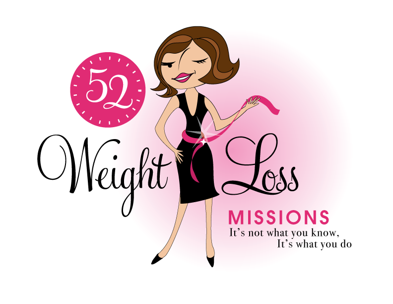
Logo 1

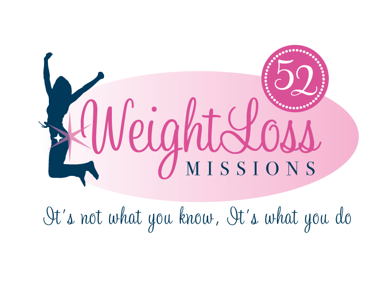
Logo 2
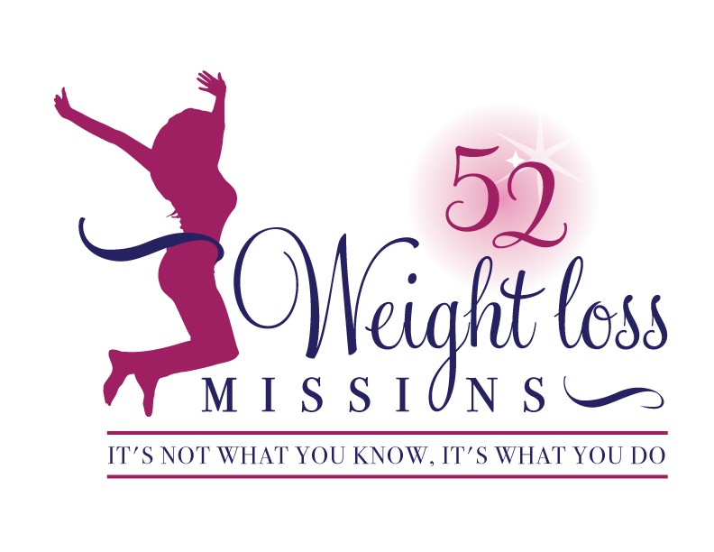
 Logo 3
 Cool Prizes
I’ll pick two commenters to receive a copy of the 52 Weight Loss Missions Action Pack as a prize. The Action Pack includes 52 Weight Loss Missions plus a range of interactive materials including a Workbook, Journal, and Planning Tools.
Want To Know More?
If you want to know more about 52 Weight Loss Missions:
I’ll let you know about special introductory offers and I’ll also announce the winners in both places.
Thank You!
I really appreciate your feedback. And good luck!
Leave a comment on this post to tell me which logo you like best, and why.

![BRAND NEW ‘52 Weight Loss Missions’ Logo Survey [I’d love your feedback! And there are cool prizes.] 1 Logo1 Logo1](https://www.getorganizedwizard.com/wp-content/uploads/2011/10/Logo1.png)
I like #1. Her “cartoon” character seems to say “it’s possible!” to me.
I like the first logo because I like how sassy she is!
Logo 1 is my favorite. The image and the colors are very eye-catching. The black and the pink make it all pop. She looks fun, sassy, and great! She appeals to me and makes me wonder what weigh-loss tips she has to offer.
That being said, the really long line of her nose bothers me. I know that she’s just a character, but it goes all the way to her hairline.
I like number 3 the best. It’s more formal & proper and I guess, as an accountant, that just suits me better!
Logo 1–fun, energetic, bright!
I *love* #1! The colors pop. It’s fun! It’s inviting and non-intimidating (is that even a word?). Draws me in and makes me wanna join in!
I like the character in #2 and the layout and fonts of #3. #1 looks too 1960’s (Jane Jetson), and oriented towards one race/ethnic group.
#2 and #3 seem to be neutral for race/ethnicity. I like that the character of #2 is more aligned in size with the fonts of the text, so I pick #2 as my first choice.
I like Number 1 the best… looks fun, easy, sassy… not too “perfect” – looks “do-able”.
Hands down #1.
They’re all cute, but logo #3 appears to be the most realistic of all of them. #1 seems much too thin to aspire to. #2 makes me wonder why there is a star on the woman’s backside. As an English teacher, your motto frustrates me with the second “it’s.” It should not be capitalized. Logo #3 has all of the words in all caps, which doesn’t make the mistake so glaring.
BTW, I noticed the iPad app. Will you have an iPhone app for any of your materials?
I vote for #3 — while #1 is pretty stinkin’ cute, #3 looks like a realistically proportioned woman. What drew me to her is that she looks like I think I will feel after going through your program!
I want to say #3, becuase it looks crisp, clean, and professional…but I have to admit that I keep being drawn to #1. #1 seems to fit with your brand the best, and it’s the most eye-catching and non-generic (which the other two are). If possible, fix the eyes a bit, they look kind of wonky at first look, and only upon really looking do I see she’s winking.
I like Logo #1 the curves and sassiness are right on the mark!
i like the fun, cute vibe of #1, but I like the larger font of your great message “it’s not what… in #3
I like logo #1! It is fun and inviting. It gives a positive energy. It was the reason I clicked to vote!
Logo # 2 🙂
I like #1. It is a little more light hearted. The thought of the Weight loss process often automatically generates a stressed & even depressed response. This one made me smile and get a more positive feeling when thinking about weight loss.
I like Logo 1 the best. I think it is more appealing color-wise and it looks more fun than the others. It really sticks out! 🙂
I like elements of Logo 1 and Logo 3. If #1 had the font size/caps of #3 for the “It’s not what you know…” it would really ‘pop’.
I really like #1. The others almost seem generic and don’t fit your brand.
I’m looking forward to seeing what you come up with!