On December 1 I’m releasing a very exciting new product called 52 Weight Loss Missions. I think this is my best product yet.
52 Weight Loss Missions: A Radically Different Approach
For most of us who struggle with weight loss, the problem isn’t what we don’t know, it’s what we don’t do.
This is where 52 Weight Loss Missions is unique. The program:
- Includes 52 action-based missions
- Focuses on actions that are smart and strategic
- Covers diet, exercise and mindset
- Helps you change the path of least resistance so eating, moving and thinking right get easier
- Draws on psychology and life coaching to help you win the mental battles
- Uses a range of cool tools to keep you committed and accountable
- Offers hundreds of practical ideas and strategies
- Is succinct and easy-to-read – 100% fluff-free
- Rewards you for taking action.
Which Logo Do You Like, And Why?
I have three potential logos for this new product – and I’d really appreciate your feedback on which one you like best, and why.
(By the way, the logos might seem a bit girly because my research tells me it’s mainly us girls who struggle with this stuff. But the program content is gender-neutral. And if you guys want one, Ill do a dude version just for you. :))
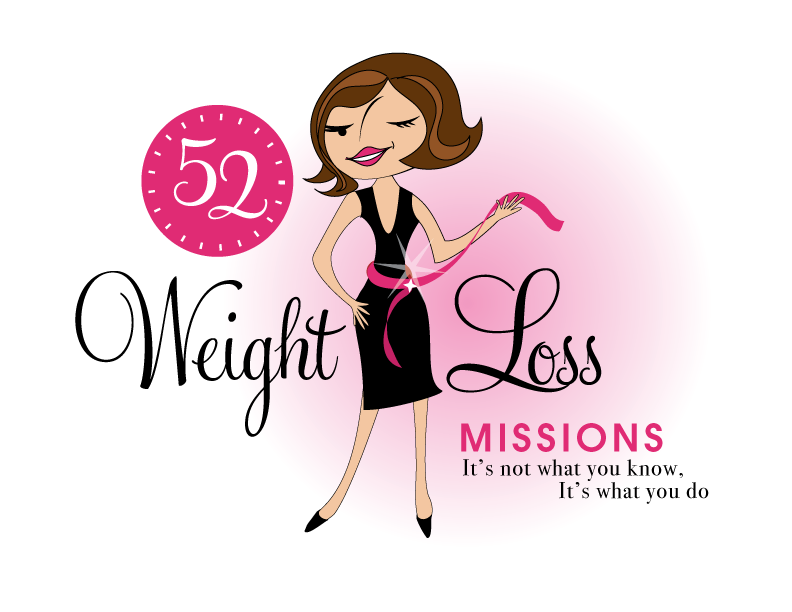
Logo 1

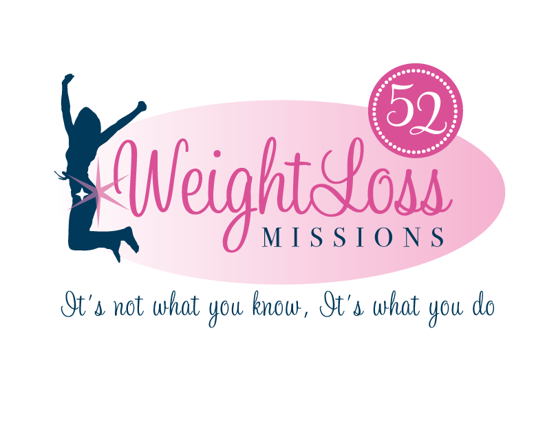
Logo 2
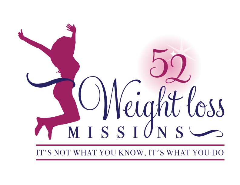
 Logo 3
 Cool Prizes
I’ll pick two commenters to receive a copy of the 52 Weight Loss Missions Action Pack as a prize. The Action Pack includes 52 Weight Loss Missions plus a range of interactive materials including a Workbook, Journal, and Planning Tools.
Want To Know More?
If you want to know more about 52 Weight Loss Missions:
I’ll let you know about special introductory offers and I’ll also announce the winners in both places.
Thank You!
I really appreciate your feedback. And good luck!
Leave a comment on this post to tell me which logo you like best, and why.

![BRAND NEW ‘52 Weight Loss Missions’ Logo Survey [I’d love your feedback! And there are cool prizes.] 1 Logo1 Logo1](https://www.getorganizedwizard.com/wp-content/uploads/2011/10/Logo1.png)
I like logo 1.
Logo #3. It expresses the way I want to feel, happy and positive and the weight loss is part of it but not all of it.
I like the first logo, it has a little 50s/60s retro feel but is still fresh and original. The second and third logos are similar to other slimming logos, I thought of Slimcea and Nimble (both breads) that used to be available in the UK.
I like #3 the best. It has a clean and shows a successful, excited woman (jumping because she has reached her goal). The 52 in the circle does not look like a clock, like in the other 2 choices. Also the woman is proportional in size, not like the cartoonish figure in #1 with the unrealistic waistline, that most woman “dream” about obtaining.
#3 also has the boldest statement of “It’s not what you know, it’s what you do”; in bolder type than the other 2 logos and defined by the strong lines above and below it. #3 appeals to me the most as I have struggled with my weight since I had my children. I lost 1/2 my body weight (I was 311# and lost 156# in 18 months) but due to medical problems and medication side effects, I have regained 65# and even though I do the same things I did to lose the original weigt, nothing seems to be working. I am anxious to see (hopefully win) the complete package and start anew on this lifelong journey together, supporting each of the others that undertake this “Weight loss mission”!
The first logo communicates sophistication, style, and charisma. It looks more interesting than the other two, in my opinion. The colors also work well with Number 1 . . . besides . . . how can you get to a better level than #1?
I like logo #1 for the great graphic appeal and color choice.
I love the first logo, it’s just so inviting, fun, and fancy-free.
Actually none of them quite hit all the marks for me but of the three I would opt for number 3. For me number 1 sends all the wrong messages with the thin hourglass figure. Numbers 2 and 3 indicate success with the jumping lady but the star on number 2 draws attention to her behind.
Logo 1, It has good balance and the lady isn’t jumping and can I relate to that.
I prefer logo #2, but I appreciate the body type on logo #3 better, If you could combine those 2, that would be awesome. I like the color and back ground on logo #2, as well as the font. I prefer the silouhette to the actual person pictured in logo #1, because I feel like more women can identify with it. I also like the font on the extended titile because it appears softer than in logo #3, especially without the lines accenting it. Thank you!
I like #1 best – it has a nice energy to it. And the girliness of it is quite fun – and I don’t always like girly. My second choice would be number 3.
I like #3 best. When I look at the figure it reminds me how free and easily I will feel (like walking on air) when I get rid of this extra weight.
I like logo #1. I think the picture is catchy and puts a face on it. The figure is too small on the second one. Font is nice on #3 but not as eye catching as the first one.
Definitely #1–sounds like a great product!!! I’m really excited to see the details.
I like #2 the best as it shows celebration after a success. My only problem with it is the 52 on the right. Maybe move the woman to the other side and move the 52 to the left.
Number One is the one I would choose. I’ve been struggling with my weight ever since I can remember. I think her face and chic appearance is what every girl dreams about becoming!
I like #1 the best. I think it is cute and fun and is more attention grabbing than the others. It makes it feel that losing weight is going to be fun.
I like #3. #1 is strange looking to me. The girl has weird eyes, lips and a strange wonky position. #2 – I don’t like the light burst on the butt. So I like #3 the best.
I like #3 the best, mostly because the body looks more realistic (no super skinny waists, etc.). Successful weight loss & renewed health and energy does not have to equate to being super thin, nor do most of us have body structures that will allow for that.
Wow; neat idea to get feedback on this!
Logo #3 :: bolder colour scheme; simple lines and silhouette; less scripty font on the tagline… all will be easier to be consistent with branding on things as small as a business card or facebook “thumbnail” or smart phone app, as well as other marketing products you may be creating that require a small logo/font.
The other designs are cute, but have too much detail and too complicated with the colour scheme.
In #3, the figure faces the right which seems to imply pursuing the goals; the figure could, in this case, be separated at times from the words, to be used as a “bullet point” for brand strengthening within your e-based promotions or on facebook etc.
All the best with this endeavour! Looking forward to seeing the final decision and especially the final product!