On December 1 I’m releasing a very exciting new product called 52 Weight Loss Missions. I think this is my best product yet.
52 Weight Loss Missions: A Radically Different Approach
For most of us who struggle with weight loss, the problem isn’t what we don’t know, it’s what we don’t do.
This is where 52 Weight Loss Missions is unique. The program:
- Includes 52 action-based missions
- Focuses on actions that are smart and strategic
- Covers diet, exercise and mindset
- Helps you change the path of least resistance so eating, moving and thinking right get easier
- Draws on psychology and life coaching to help you win the mental battles
- Uses a range of cool tools to keep you committed and accountable
- Offers hundreds of practical ideas and strategies
- Is succinct and easy-to-read – 100% fluff-free
- Rewards you for taking action.
Which Logo Do You Like, And Why?
I have three potential logos for this new product – and I’d really appreciate your feedback on which one you like best, and why.
(By the way, the logos might seem a bit girly because my research tells me it’s mainly us girls who struggle with this stuff. But the program content is gender-neutral. And if you guys want one, Ill do a dude version just for you. :))
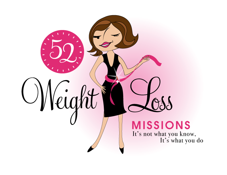
Logo 1

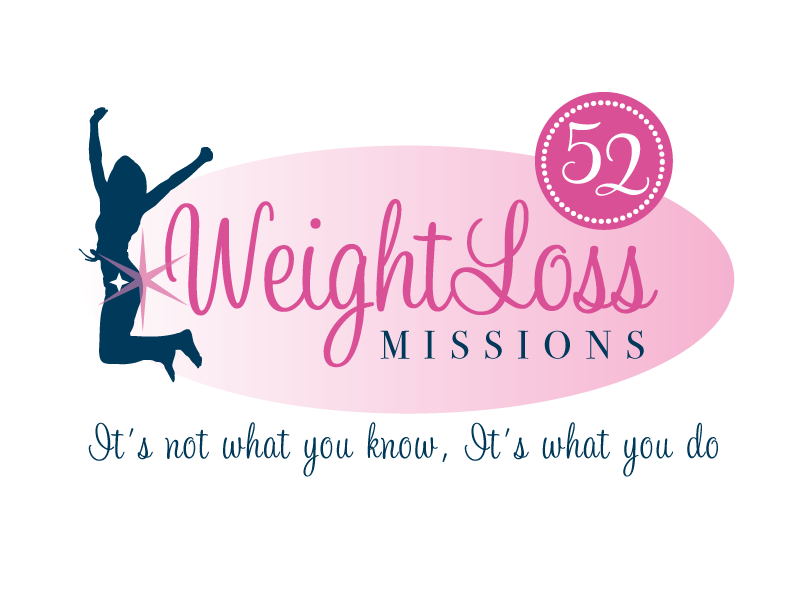
Logo 2
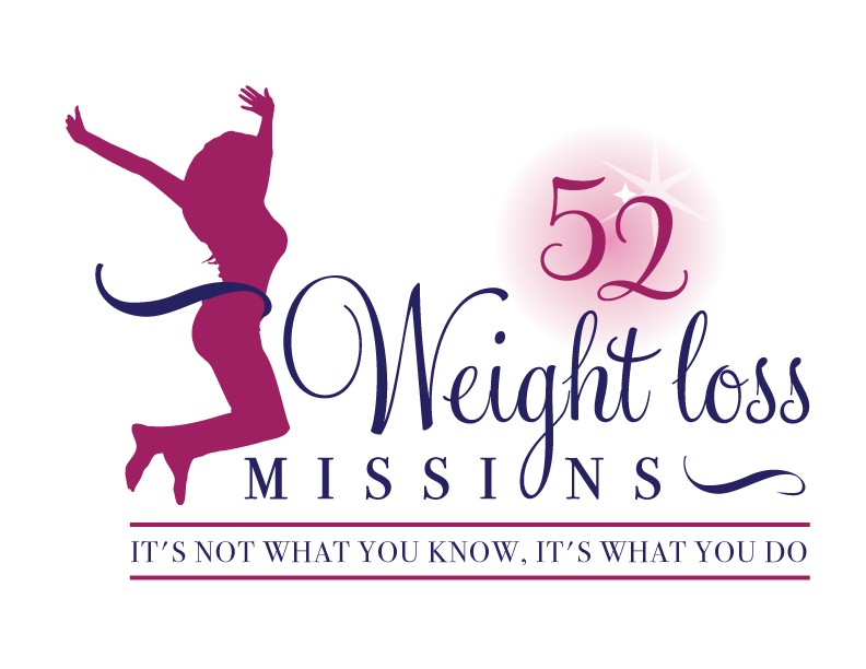
 Logo 3
 Cool Prizes
I’ll pick two commenters to receive a copy of the 52 Weight Loss Missions Action Pack as a prize. The Action Pack includes 52 Weight Loss Missions plus a range of interactive materials including a Workbook, Journal, and Planning Tools.
Want To Know More?
If you want to know more about 52 Weight Loss Missions:
I’ll let you know about special introductory offers and I’ll also announce the winners in both places.
Thank You!
I really appreciate your feedback. And good luck!
Leave a comment on this post to tell me which logo you like best, and why.

![BRAND NEW ‘52 Weight Loss Missions’ Logo Survey [I’d love your feedback! And there are cool prizes.] 1 Logo1 Logo1](https://www.getorganizedwizard.com/wp-content/uploads/2011/10/Logo1.png)
I like the first one – its sassy and it looks ‘real’ – the other 2 look like several gym logos I have seen – and are, as the other say, Faceless.
May I also say , as a guy, the logo wouldnt cacth me – however I appreciate I am not your target market . Again though , if I may say , the approach I think your programme will have will suit guys equally as well – if not better – so I DO encourage you to source a male oriented logo as well – and I can offer help in brainstorming if u like – Best Wishes Richard
I like #1 the most. the other two are also good. I prefer #1 because it looks like more “fun”. I really like the motto too. Those of us that have this issue have for the most part , heard it all. We know what to do, but its the support to keep us on board that will help us do it. So I’m voting for #1.
I like number 3 the best. I don’t like the face in the woman in #1 and the I don’t like the little sparkle on the behind in #2, so #3 wins!
I love logo #2. It is very motivating. The character in the logo seems very happy and enthusiastic, as well as fit. There is a sparkle in the image which makes me want to shine. The overall image seems to be very motivating without being overt.
I like the first one. Compared to the other 2, it looks more current/modern.
I like the first one! Love her wink and the colors! And I love the idea of 52 things to do to achieve weight loss…especially the tag line…It’s not what you know, it’s what you do! I know for me, I have lots of information, but if I don’t apply it, I am not going to make any progress! Excited to see what the missions are!
I choose #3. I think “Weight Loss Missions” in that one is a bit too frilly, but the image of the girl is healthy and realistic and the rest of the lines are clean and eye-catching. Definitely NOT #1. To me, that one screams “impossible Barbie proportions,” which is the kind of idea we’re trying to dispel for today’s women and girls. If not #3, then #2 is ok.
I like #3 best. It looks more serious, like there will be important content in the missions, but still has energy and fun.
I don’t like the fact that #2 has her back to the logo, and I don’t like the “sparkle butt”. I also don’t like the fonts as much as in #3.
#1 reminds me of the Jetsons cartoon (I guess I’m showing my age). I don’t take it seriously.
I like logo #1 the best – the spunk and fun that the woman in the logo embodies speaks volumes to me. 🙂
Logo #2 seemed to be a bit “blah” for me. It didn’t catch my eye.
Logo #3 while great, just didn’t ring as “catchy” as the first. I’d be hard pressed to say that it isn’t good, because it is – I just like #1 best. 🙂
Logo 1 is my favorite.
I like the first logo – the elements (color, style, graphic placement, etc.) catch your eye more than the other two. It’s unique and would hold my attention long enough to try and find out what the “52 Missions” were all about!
I like # 1 because it brings in pictures from already established logos through all your programs. The circle with the 52 has the marks around it like a clock saying (to me) it’s time to start this weight loss journey. The person in number one is the same type of people that you have on some of your other programs so if I saw this in a store or at a friends house I would pick it up wondering if it was written by you since the logos are similar. Number 1 grabs your attention and it stands out from the other two choices and it’s also fun and sophisticated.
I love logo #1, its cute and fun looking. Loosing weight is hard work and to have something that is fun looking to help it a great idea!! I know I need all the help & motovation, can’t wait to see it!! Good Luck
#2 works for me. I like the celebratory jump of the image. But I like the “52” design element from logo 3, so I would combine those two elements and put the “52” in black. Overall, all three designs are great! So sorry about your dad.
Number 1 is my fave.
It’s understated yet it’s got that sassy wink and smile. I like that the body type is exaggerated enough not to be taken too seriously signifying to me that everyone’s ideal is different. The other 2 are great but I just don’t think being seen in mid air is the only way to express freedom and joy over reaching a goal.
Have an awesome day!
I like #3 best. #2 would be fine, if the woman didn’t have a starburst on her rear end. And I see how #1 could be cute, but I think it promotes an unhealthy self-image and most of the woman your product would appeal to probably already struggle with that.
I like number 3 the best. It is clean, yet compelling.
#3 as it portrays a more accurate female body. I also like the boldness of the subtitle. The first one is cute, but her waist is way to small and that image is pushed enough in our society.
I like 2 best. 1 looks like a chic lit character and 3 looks like a pole dancer. I don’t think we should ever aspire to be a cartoon character we need to keep it real.
I like the first one. It looks more unique than the other two and it just screams “personality”!