On December 1 I’m releasing a very exciting new product called 52 Weight Loss Missions. I think this is my best product yet.
52 Weight Loss Missions: A Radically Different Approach
For most of us who struggle with weight loss, the problem isn’t what we don’t know, it’s what we don’t do.
This is where 52 Weight Loss Missions is unique. The program:
- Includes 52 action-based missions
- Focuses on actions that are smart and strategic
- Covers diet, exercise and mindset
- Helps you change the path of least resistance so eating, moving and thinking right get easier
- Draws on psychology and life coaching to help you win the mental battles
- Uses a range of cool tools to keep you committed and accountable
- Offers hundreds of practical ideas and strategies
- Is succinct and easy-to-read – 100% fluff-free
- Rewards you for taking action.
Which Logo Do You Like, And Why?
I have three potential logos for this new product – and I’d really appreciate your feedback on which one you like best, and why.
(By the way, the logos might seem a bit girly because my research tells me it’s mainly us girls who struggle with this stuff. But the program content is gender-neutral. And if you guys want one, Ill do a dude version just for you. :))
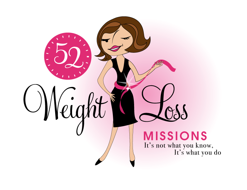
Logo 1

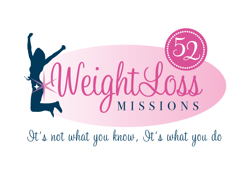
Logo 2
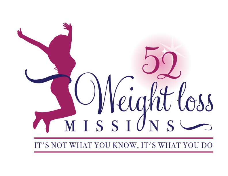
 Logo 3
 Cool Prizes
I’ll pick two commenters to receive a copy of the 52 Weight Loss Missions Action Pack as a prize. The Action Pack includes 52 Weight Loss Missions plus a range of interactive materials including a Workbook, Journal, and Planning Tools.
Want To Know More?
If you want to know more about 52 Weight Loss Missions:
I’ll let you know about special introductory offers and I’ll also announce the winners in both places.
Thank You!
I really appreciate your feedback. And good luck!
Leave a comment on this post to tell me which logo you like best, and why.

![BRAND NEW ‘52 Weight Loss Missions’ Logo Survey [I’d love your feedback! And there are cool prizes.] 1 Logo1 Logo1](https://www.getorganizedwizard.com/wp-content/uploads/2011/10/Logo1.png)
I prefer #1. It’s catchy, also you can relate to it. We’re often motivated to lose weight for how we look in the real world, not just at the gym…
Nice to have you “back” Michele…
#1 all the way! While I do like some elements of #2 and #3 – that “clipart” lady just bothers me too much.
Good luck with your new project!
Logo number 1. It just gives me the will power to resist temptation and keep working on losing weight.
I definitely like #1 the most. I was immediately drawn to it, and found it to be the easiest to read, not just because of font choices, but also layout. For me, the second and third options look like logo designs I’ve seen before, and are not innovative or attention grabbing. And if an image could be cliche, a jumping silhouette is most certainly that.
#1 is also appealing in that it gives me the impression that if I know what those 52 missions are, I will be happy and successful too. You lose something having too much anonymity and no expression on the female image of the other two choices. I don’t look at the jumping silhouettes and think, “That could be me!” But I do imagine myself happy, even coy, in my basic black dress, proud of my success! – a feeling I get from #1.
Logo #2 cought my eye firts, love it and good luck!
I definitely love the first one! I like the cute and sassy woman with a measuring tape. She looks like she is ready to play!
I like logo #2 best. I love the font and the pic is very energetic and has personality! Actually, all 3 are very good.
i luv the 1st one!
I love logo #1 the best. The colors, the tones and shading are very balanced. I love that it’s a caricature of you which gives it a personal touch and shows a warmth of you standing behind your products.
Logo #2 is my second choice. Not so sure I like the jumping blue silhouette lady. Perhaps if it was the caricature from logo #1 it would work better for me.
Logo #3 is my last choice. The letter O is hard to read in Missions, it took me a second for my eye to realize that the O was from the the lower part of the G. The lines above and below the tag line are very bold which draw your attention to the tag line and not to the name of the business.
I’m excited to hear about your new product! Sounds fabulous!!!!
Logo #3 is my personal favorite. I like the ribbon without the sparkle. Number 2 is alright but I don’t like the sparkle on the butt. I have a long, LONG way to go before I look like #1 so it’s a no for me as well.
Hi!
I like number one. Very cute. 🙂
I like # 1 best. I like the colors, but I think the thing I like best is she looks…..older. That’s not the best word, but…. The other two make me think of athletic 20-somethings…which I am not. # 1 looks more like she could be ‘any woman’….maybe a homemaker, maybe a working mom, etc.
I like logo #3 especially the way the “g” in weight is the “o” is mission. pretty snazzy!
I like number three. The first one seems rather “retro” and I think you want a more modern vibe. The sillouette on the second one seems too thin to me — not a healthy objective. The third one is well-done — the woman’s figure seems healthy and athletic, the horizontal lines ground the cursive script above, and I like the way the loop of the G ties into the word missions.
I like #1 the best. I don’t think it always has to do with how the woman on the logo looks. There are beautiful women of all shapes, sizes and colors and you can’t portray every one of them in one logo. #1 reads the best and graphically catches the eye more so than the others. Good Luck with this new venture!!!!
I like #1. I think it’s colorful and I like the feminine touch. I also like the tape around a small waist – which I would love to have. I’m not hip on the jumping logos and the #2 logo has a star on the butt.
I like #1 the best. It is the one that most captures my attention. I like the black dress – the woman seems stylish. The star seems to put the emphasis on her waist. And it is good to see her expression, although her nose line is a little bit weird.
I don’t like #2 with the star on her bottom.
#3 is my second choice, but she looks naked.
I like #1! Very cute 🙂 Can’t wait to hear more around the first of December!
I think I like #1 the best. It’s the most fun to me. It looks like someone you could relate to unlike the anonymous silhouettes in the other 2. I just think it’s the cutest & most fun.
I like Logo #3 It is clean and fresh, the ribbon around the waistline is nice and the title within the lines is clear. The fonts are easy to read.
The star on the butt in #2 is not my favourite
Number 1 is fun and flirty but when looking quickly it takes longer to read with the character in the middle. Love the cartoon though..very fun it reminds me of a vintage advertisement – cute
Personally, when browsing the book shelves, I want titles to be quick and easy – the simpler the title the better. The content needs to be substantial but the cover, the logo, the ad copy needs to be crisp and give me the info as quickly as possible.