On December 1 I’m releasing a very exciting new product called 52 Weight Loss Missions. I think this is my best product yet.
52 Weight Loss Missions: A Radically Different Approach
For most of us who struggle with weight loss, the problem isn’t what we don’t know, it’s what we don’t do.
This is where 52 Weight Loss Missions is unique. The program:
- Includes 52 action-based missions
- Focuses on actions that are smart and strategic
- Covers diet, exercise and mindset
- Helps you change the path of least resistance so eating, moving and thinking right get easier
- Draws on psychology and life coaching to help you win the mental battles
- Uses a range of cool tools to keep you committed and accountable
- Offers hundreds of practical ideas and strategies
- Is succinct and easy-to-read – 100% fluff-free
- Rewards you for taking action.
Which Logo Do You Like, And Why?
I have three potential logos for this new product – and I’d really appreciate your feedback on which one you like best, and why.
(By the way, the logos might seem a bit girly because my research tells me it’s mainly us girls who struggle with this stuff. But the program content is gender-neutral. And if you guys want one, Ill do a dude version just for you. :))
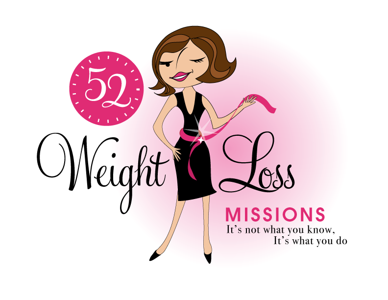
Logo 1

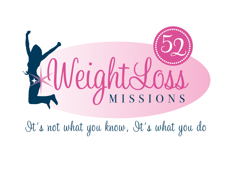
Logo 2
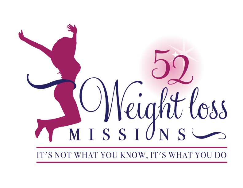
 Logo 3
 Cool Prizes
I’ll pick two commenters to receive a copy of the 52 Weight Loss Missions Action Pack as a prize. The Action Pack includes 52 Weight Loss Missions plus a range of interactive materials including a Workbook, Journal, and Planning Tools.
Want To Know More?
If you want to know more about 52 Weight Loss Missions:
I’ll let you know about special introductory offers and I’ll also announce the winners in both places.
Thank You!
I really appreciate your feedback. And good luck!
Leave a comment on this post to tell me which logo you like best, and why.

![BRAND NEW ‘52 Weight Loss Missions’ Logo Survey [I’d love your feedback! And there are cool prizes.] 1 Logo1 Logo1](https://www.getorganizedwizard.com/wp-content/uploads/2011/10/Logo1.png)
#1 got it goin on. It’s fun and it conveys the message of weight loss and happiness very well.
I like Logo 2. It has a light, free feeling to it, what you envision feeling like after you have lost weight. Very appealing!
I like 1 best overall. I also liked 3 but couldn’t get past the spelling of mission, or missin with the g as the O, That drew away from the purpose for me.
I prefer Logo #1 – It is more whimsical and fun! AND MAKE HER STRIPPED IN COLOR SO THAT PEOPLE WHO GET OFFENDED EASILY WILL NOT HAVE THE OPPORTUNITY TO COMPLAIN ABOUT HER COLOR!!!
I really like logo #2. The lines are clean, it looks polished and I love that the silhouette is in action!
#1 is admittedly adorable, but soooo wrong for a woman who is trying to be inspired to lose weight and become active. It is a Stepford cartoon who could be vying for a spot on one of those Real Housewives shows. There is a major disconnect between the formal attire (and her proportions in it) and the average woman’s journey toward self-empowerment and healthy living. You also run the risk of alienating women of other races with this design. I do, however, really like the circle around the “52” and the font used here.
#2 is my least favorite because of the strange sparkling butt and the all-cursive font. It reminds me very much of the racks upon racks of bridal how-to books I browsed when I was planning my wedding. There’s something in the overall impact of this logo that is borderline unpleasant for me.
#3 is my clear winner. The ageless, faceless, race-less woman will appeal to everyone. The fact that she is jumping shows that she is active and powerful. I like the ribbon-slicing effect at her waist as if she has just completed a race. I also really like the pink bars bringing emphasis to the subheading “It’s Not What You Know…” This one feels powerful and real compared to the other options. It is inspirational. I feel like I want to discover this woman’s secret so I, too, can jump for joy at my accomplishments!
I like number 3 the best. It was close between two of them, but hopefully you will be able to discern what God has in store for you. Many blessings as you move forward.
#3 is my favoite. The colors give the idea of strength. The female figure is less stylistic than the other two logos and I love her exhuberance. And the tagline “It’s Not What You Know, It’s What You Do” is not as easily passed over as it is in the other two, and I find that to be the most important concept in the logo.
-The first is trendy and might need to be changed when the chick-lit style passes. I have never been drawn to the trend to start with and the logo seems to convey the idea that this is something that’s been around awhile. Nothing new.
-The second–I don’t see pink as a “strong” color and is cliche-ish for women. Also the star on the rear end bothers me. Too many soft lines that don’t seem as “solid” and attention grabbing as the the other two logos.
I love Logo 2. It is very celebratory, AND neater and prettier writing than #3.
If the three logos, #1 appeals to me the most. The character is a ‘real’ person (even if she is just drawn!) and that factor makes this the most interesting logo. I would like to work on my goals with her rather than a faceless jumping person. Because #1 is so realistic, I can imagine that she would struggle and overcome challenges along with me on this journey. Thanks for asking for our opinion!
I think #1 is the cutest – but NOT THE BEST for this program. If the program focuses on realistic missions toward weight management, the first logo sends the wrong message – nomal women will never have proportions like Wilma Flintstone!
I would vote for #3 as it shows a woman of normal proportions, with no indication of race or specific age. The message that sends is more important than the cartoon “cuteness” of #1.
Thanks for the opportunity to express my opinion!
Logo 1, because it sticks with your current branding reinforcing your branding.
But remove the wink because it won’t translate when the image is small, it will look like the image was messed up.
And remove the pink cloud from behind. It won’t translate well in other applications.
I like #1 best because it’s more personal. I don’t just see a shape jumping (something I can’t do anymore because of several chronic conditions); I see a real woman, just like me (only skinnier).
I like #2, it’s a cute icon and it shows a shapely image of a woman.
As a Graphic Designer I perfer the first one since it’s custom and not and image from stock or traced like #2 and 3 looks like. Although I would fix the leg and the face of #1 woman. Looks a bit weird to me.
Best,
Nat
I vote for #1.
1. Like that the circle around the 52 looks similar to a clock. I feel this portrays that reading will be timely and segmented.
2. Girl is very chic. Love the bling around her waist so that it draws your attention to it. I think this will reach career women along with moms.
3. Like “Weigh Loss” in black. It stands out. Like the font as well.
Least favorite is #3. It just doesn’t “pop”. It seems cliche.
I like #3. #1 has weird proportions, for some reason. Although it’s better then I could do – but #3 seems better..
#2 has a shiny thing that draws attention to her booty. LOL I didn’t like that either. :giggle:
I prefer #3, for many of the reasons others have stated. I’d like it better if the “52” from Logo #2 moved into #3 to replace the one there. My objection to #1 has also been stated: it’s that Barbie unattainable body.
I don’t like logo #1 because the woman is too skinny plus the belt she has around her waist points out the fact that she has a disproportionately small waist. I get enough of that in magazines. Logo #3 again with the ribbon around the waist is pointing to the fact that we are supposed to have tiny waists. I am a woman and I have curves! I like them! Do I need to loose weight? Absolutely! But I don’t need to look anorexic to be beautiful!
I like logo #2 because the woman has curves and she also looks happy and excited to be “going on the mission”. And please keep the sparkle on the behind because I think it’s okay to be healthy and still be proud to have some curves. Let that booty “shine” so to speak!
Logo #1 is my favorite & my vote, but I also like #3.