 I’m very excited about the upcoming release of My Business Organizer – a set of more than 250 interactive worksheets and planners to help you plan, manage and grow your business.
I’d love to create a cover that resonates with you, my readers and customers – so I’m asking for your opinion, please!
I’ll pick two commenters to each receive a complete copy of My Business Organizer as a prize.
About My Business Organizer
My Business Organizer is ideal for home businesses, coaches, consultants, and solo business owners, but almost any small business can use these the interactive, motivating forms and planners to achieve greater business success.
My Business Organizer covers:
- Productivity & Time Management
- Goal Setting & Decision Making
- Staff & Office Management
- Professional Development
- Business & Marketing Planning
- Expenses & Accounts
- Managing Clients & Contracts
- Business Entertaining & Travel
- Technology & Social Media
- Professional Business Forms for External Use.
Would You Please Take a Look?
| A | 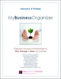 |
B | 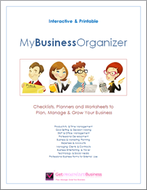 |
| C | 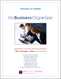 |
D | 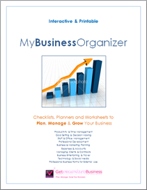 |
| E | 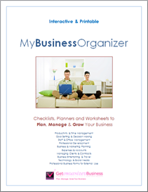 |
F | 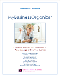 |
Each of the draft covers has been designed to evoke some aspect of being an entrepreneur.
Please pick your top three covers, and rank them 1 (favorite), 2 and 3, using the letter to the left of each cover to identify it.
Which cover do you like, and why?
Please leave your feedback as a comment.
I’ll contact the winning commenters by email and also announce the winners in a blog post.
Thank You!
I really appreciate your time and thought – thank you so much for your input. 🙂

1. E
2. C
3. F
I chose these b/c they all have real people in them. I like E because it has both a man and woman, and they are doing what so many solopreneurs do – sit on their couch with their laptop, working away at home.
C has both genders – much more business/office feel than work at home. So I guess it depends on your target, and whether the contents are more toward one than the other.
F is the other one with a person. Kind of too casual, and only one gender.
I don’t like the graph at all – feels sterile to me. The plant growing – well, I get the meaning, but that image has been used so often for so many different things that I think it has been over-done. And the little cartoony pictures are just too silly for my taste – not suitable for business.
That’s my .02 cents!
A-because it makes organizing seem so relaxing and calming
F-because women work so hard in so many different venues of their lives
E-planning life together is very rewarding
1. F
2. A
3. D
I was immediately drawn to F first but struggled because I like A so much, too!
I already love your Ultimate Pack and can’t wait to see the new business organizer! It’s exactly what I’ve been looking for!
1. B
2. F
3. A
1B – It’s for everybody and everybody enjoys this system
2F – It doesn’t seem like work, you can relax and do it with fun
3A – It’s something you have in your hands, that you master yourself
and you can take care of this young plant (your business) and make it grow. 😉
1. A
2. E
3. F
A is non-gender/non-business specific and love the idea of growth, freshness and a little bit of a zen feel. C/D are a little too dry and “corporate” looking. I have to agree with the comments by Tina Mayo. The look is the key to whether I’m interested.
I’m drawn to F – even though it could come across as gender-specific.
E could also be great if you decided to branch out to a personal financial planning program or maybe some sort of “couples” life design program.
Can’t wait to see the winner!
I like
1. f
2. a
3. b
F is my fav b/c it looks like an avg. woman working from home.
I like A. because it makes you think of growing your business.
I like b just b/c it’s cute. 🙂
I like
1. f
2. a
3. b
F is my fav b/c it looks like an avg. woman working from home.
I like A. because it makes you think of growing your business.
I like b just b/c it’s cute. 🙂
A, F, E. Good luck.
Warm wishes,
Mark.
B
C
F
I like B first as it shows you are not SUPER serious!
F
E
A
They all have a sense at business at home. I especially like F and E as they both give a sense of comfort and I tend to type on my couch, as does my husband. ‘A’ gives a sense of growth, new beginnings.
Great Work, Michele! Here’s my opinion:
1. E
2. A
3. D
Here’s why: I like E best because your ideal target audience (myself included) can relate. Even if they don’t sit at the couch, they have thought about it! It’s a comfortable place, comfortable picture and if I can be more organized and productive and still do business like that, I’m in!
I chose A next because the target audience you mentioned are often transformational entrepreneurs… people who want to transform the world through their business. They do their business to make a positive difference, and I see the plant as not only as something growing, but one that requires nurturing. I think your transformational entrepreneurs will relate to nurturing their business as it grows.
Finally, I chose D because the chart of growth is something more analytical persons would easily relate to. It is clear. However people who are like that may already be organized and not a good candidate for your products. I don’t see the other “business images” or “socializing” images being equated with business growth for your target market as much as the chart, but I really prefer the first two choices (E & A).
1. F
2. A
3. B
I like these best because they feel like my personality – professional but relaxed. D is much too business-y for me and not at all light-hearted. C reminds me too much of life in the corporate world.
1) D
2) F
3) E
love the colors of D……and we all want to make a profit.
F tells the story of what we all want ……getting organised to enjoy a great lifestyle
E …….again the lifestyle image is attractive to me
keep up the excellent work
A – highlights the essence of “growing, nurturing” from the start (seedling)
C – growing a business/organization is not, and should not be gender-specific, there must be a team effort involved
D – over TIME, not overnight, if you stay focused and do the right things, you will see GROWTH
1. A
2. D
3. E
Best of luck with it! I really like A…the growing plant is a great pic, in my opinion to have on the cover!!! 🙂
B – Caught my attention first with the bright, attractive colours
A – Gives the sense of growing and looking after the business carefully as well as fitting with the green, eco feeling which is popular now
F – I’m a work at home Mum and like to think that the system could help me be organised and relaxed instead of always stressed
1) A
2) D
3) F
I like:
F – because it shows that when you are organized, you have more time to relax and actually enjoy your business
A – because it symbolizes growth
D – because it depicts growth in a very powerful way (because when it comes down to it, we all want to make more money!)
D – because it represents what we are all trying to do in our business
B – because i love funky artwork like this
E – because it represents both men and women working at home
Best of luck and congratulations on your new project.
1. B: the bright colors captured my attention immediately…casual but also denotes a business like demeanor…the women with their hands up show strength and they’re making a point…as in “listen to me…I have something important to say”
2. F: The woman looks relaxed and in charge at the same time because she is organized and has her priorities in order…things are going well for her and the look on her face speaks volumes, that she is enjoying her success
3. C: I think this may have made a stronger statement if the woman was actually sitting at the laptop with two men on her side…making her the focal point of the photo but also, maybe the women are teaching him a thing or two on the laptop…still a professional looking photo