 I’m very excited about the upcoming release of My Business Organizer – a set of more than 250 interactive worksheets and planners to help you plan, manage and grow your business.
I’d love to create a cover that resonates with you, my readers and customers – so I’m asking for your opinion, please!
I’ll pick two commenters to each receive a complete copy of My Business Organizer as a prize.
About My Business Organizer
My Business Organizer is ideal for home businesses, coaches, consultants, and solo business owners, but almost any small business can use these the interactive, motivating forms and planners to achieve greater business success.
My Business Organizer covers:
- Productivity & Time Management
- Goal Setting & Decision Making
- Staff & Office Management
- Professional Development
- Business & Marketing Planning
- Expenses & Accounts
- Managing Clients & Contracts
- Business Entertaining & Travel
- Technology & Social Media
- Professional Business Forms for External Use.
Would You Please Take a Look?
| A | 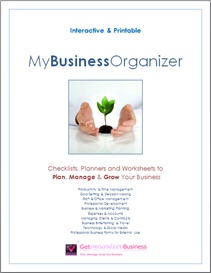 |
B | 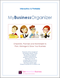 |
| C | 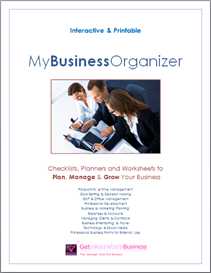 |
D |  |
| E | 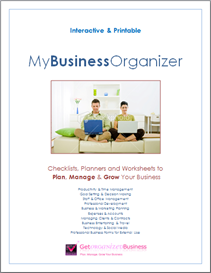 |
F | 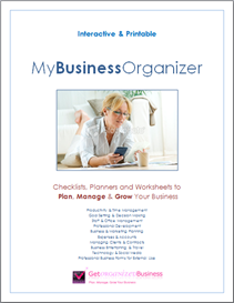 |
Each of the draft covers has been designed to evoke some aspect of being an entrepreneur.
Please pick your top three covers, and rank them 1 (favorite), 2 and 3, using the letter to the left of each cover to identify it.
Which cover do you like, and why?
Please leave your feedback as a comment.
I’ll contact the winning commenters by email and also announce the winners in a blog post.
Thank You!
I really appreciate your time and thought – thank you so much for your input. 🙂

A…This cover makes me think about hope…and says my business future is in my hands
E: I like the home setting and the look of team work…
F: This cover makes me think of a business that is done on MY terms..
1. A – new beginnings, clean and simple
2. B – fun, playful, non-imitidating
3. F – appeal to women
What did I see? First impressions!
1. C … Collaborative … teamwork
2. B … Spirited, energy
3. A … Nurturing
D … focused on profit maximizing … a topic for your next book
E … laid back, casual
F … a medical or dental clinic
1. F – She looks like a professional, but in the comfort of her home.
2. E. – Again , the home atmosphere.
3. B – Fun but also professional.
Great Job.. They all look great…
1. A
2. C
3. F
My ranking is based on what I as a professional asset manager would take an interest in reading if this publication came across my desk. I get a lot of publications and, as shallow as it seems, much of what I decide to read is based upon presentation and the “teaser” comments on the cover about the content. If it doesn’t speak to me as professional, interesting and useful at a quick glace of it goes in the round file. You only have so much time to research new and interesting material and I’m afraid it often boils down to the package.
Good luck to you!
1,a, Small businesses are all about growth
2 e.looks like what is popular on the market
3. ditto for f these are all about do it yourselfers at home where most businesses seem to be these days. Don’t know the stats but you could check online.
1. A – Growth
2. B – Team
I didn’t really like and/or connect with the other options. C & D seemed too corporate, while E & F seemed too casual.
1. C – Gives your company the look that you are professional and growth of your business is ascertained
2. B – The characters remind me of a President; Secretary; Office Manager and Accountant. A well organized leadership team that is ready, willing and able to do what it takes to grow your business.
3. D – Walk the books of knowledge to the top and your company has grown to make the Forbes List.
Here is my info:
B – The characters! They decrease the natural “fear”, when you think/talk about organization.
A – The tree image! Because it represents that we will growth in knowledge, same as a tree does.
F – Woman image! Because woman organize more than just business, we organize our families lifes, jobs, ourselfs, etc.
1. F – I have a home-based business and this makes me think of myself when working at my desk.
2. C – Makes me think this organizer would work for both male & female.
3. A – Growth! So important in a business!
1) B
2) D
3) F
1. F-once you are organized you will be relaxed.
2. A-You HAVE to be organized in order to grow your business.
3. C-As an entrepreneur you are always collaborating and/or brainstorming with someone or a group.
1. B: The colors captured my attention and make me want to open it to see what’s inside. It’s not too cutesy and will appeal to both men and women. It’s contemporary, fresh, and seemed more energetic to me than the others.
2. A: I like this one because usually one associates growth with business. This cover made me feel like the information contained in the organizer would be helpful in starting and growing my business. Again, it made me want to look inside the organizer and start using it.
3. E: I felt this one appealed to both men and women equally. Unlike ‘C’, it’s more middle of the road. I think your target audience (e.g. solo biz owners, home biz owners) will be able to relate to this cover instead of professionals in business suits.
As someone who is embarking on starting a biz, I’m excited to see what you’ve come up with!
I would pick the covers in this order:
1. B
2. D
3. F
Great site! Love to see what you end up picking.
Colleen
1. A
2. D
3. B
Mainly because A and D don’t show images of people. Think of the principle of staging a home for sale – you have to remove pictures of yourself, so that a buyer can “picture” themselves in the home.
Same thing here – you want as many people as possible to identify with the image. I don’t identify with C because that’s not my business niche, and many home & small businesses don’t look like that either (it’s very high-powered/corporate).
F is a woman, which I do identify with, but potential male clients and more traditional office managers won’t because of the setting and tone (it looks like a mom at home or a woman running a casual, home-based business).
E looks WAY too casual – like a fun evening at home, not work-related at all.
B is ok, but maybe not serious enough; it’s too cutesy. There’s other art out there that can achieve the same effect and look more artsy than cutesy. (If was more artsy, I’d probably vote for B first.)
That’s why I like A and D the best – no faces for people to *not* identify with, and they both symbolize growth, which is what you’re trying to help people do with their business.
Good luck!
Good Morning, from sunny West Palm Beach, FL, USA.
I’m on #2 of the big 52 organized missions, thanks to you. It is fun. As for the covers? Here are my choices:
1. A = growth
2. F = I can tell she is working from home.
3. D= Yep, my income is taking that direction
Thanks, can’t wait to see the results.
B
C
F
I think these would be most appropriate for a product aimed at small/home based businesses.
Hi Michele
I like
1. D
2. F
3. C
I’m interested to see which you go with.
Angie
1. F
2. B
3. E
I like those three the best because they are not stuffy and all business like. I realize that this is a serious organizer, but it doesn’t have to be boring which I’m sure I isn’t since I have your other ones and they are fun.
I particularly like f because that is how I work often. At home, very comfy, but yet I’m working and I do take my business seriously.
I can’t wait to see this newest organizer. Love all your work.
So glad you are creating this Michele – very excited!
Here’s my vote:
1) F
2) B
3) D
Can’t wait to see it!!