UPDATE: The competition is now closed.
Check out the Design Your Life logo and winners here!
You may know that we’re releasing the 12-month Design Your Life Program very soon.
This will be our most comprehensive program so far. It’s based on the popular Life & Goal Organizer DIY system, but I’ve chunked it down and made it accountability-based with monthly workbooks, weekly e-classes, action plans, accountability checks and exclusive member forums.
We’re now finalizing the logo, and want to choose something that resonates with you – our readers and customers.
Would you please take a look?
I’ll pick one commenter to receive an entire 12-month Design Your Life membership as a prize.
Colors
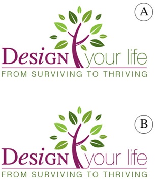
Above you’ll see 2 color combinations
Which do you prefer?
- A
- B
Tag Lines


Above you’ll see 2 tag lines in addition to the topmost one.
Which do you prefer?
- From Surviving To Thriving
- Your New Life Starts Here
- The New You Starts Here
Please leave your feedback as a comment.
And thank you – I very much appreciate your time and thought. 🙂
![]()


Design B is the way to go. The tree is a good color contrast that ties the taglines together so for marketing purposes you’ll want each line of words to be one color so it just flows and isn’t too busy.
Option 1 is the best choice because it changes things up and doesn’t repeat any words. Also, the 2nd and 3rd choices feel like running from where option one is running to. (ex. running from the stick as opposed to running to the carrot.) I think part of the goal in learning to be organized is the transition one wants to make in going from a stick runner to a carrot go getter.
Hi Michele,
I prefer design B, it’s symmetry is very pleasing to the eye. As for the tag line I think “The new you starts here” encapsulates it all, a “new you” gives you a new life, a new outlook and takes you from surviving to thriving.
Thank you for the opportunity to comment and good luck!!
Hi Michele,
I prefer design B, it’s symmetry is very pleasing to the eye. As for the tag line I think “The new you starts here” encapsulates it all, a “new you” gives you a new life, a new outlook and takes you from surviving to thriving.
Thank you for the opportunity to comment and good luck!!
I perfer A, in the first example, although I really had to look to notice the difference in color.
I perfer the first tag as well….I don’t particularily want a new me or a new life, I just like to be organized!
Thanks for the opportunity to participate!
Sherry
I perfer A, in the first example, although I really had to look to notice the difference in color.
I perfer the first tag as well….I don’t particularily want a new me or a new life, I just like to be organized!
Thanks for the opportunity to participate!
Sherry
I prefer color scheme B, and Surviving to Thriving. Thanks!
Amanda
I prefer color scheme B, and Surviving to Thriving. Thanks!
Amanda
I prefer color combination B and the tagline: “Surviving to Thriving.”
I prefer color combination B and the tagline: “Surviving to Thriving.”
I definitely like option B better – with two colors the thought gets broken. You may want to consider using the font you used for “Design” for “your life” as well to maintain continuity.
Your audience is people who are already insterested in organization, goal setting, accountability, etc. Your product is a new and realistic (with the chunking of activities) way to gain the above. But I’m thinking it is probably a “redesign” not just a blank canvas to begin with for many of your readers. You may want to think about using “Redesign your life.”
I got stuck on the taglines. The word “life” shouldn’t be used because you have it above. “Survive to thrive” is what I think the audience will do, but it won’t necessarily resonate because it doesn’t include anything that says “you.” Some words you might want to throw around are “cultivate” (especially with the tree), “foster,” “transform,” “grow,” and “produce” and “strengthen” followed by “your” and a synonym for “life.” Perhaps “Cultivate (or “Grow into”) the best you.” Something like that anyway!
And l love the tree – it’s a perfect representation of organized growth.
“Your New Life Starts Here”. Where do I sign up????? It says it all. Well done. (prefer colour B too).
“Your New Life Starts Here”. Where do I sign up????? It says it all. Well done. (prefer colour B too).
I prefer color combination A with the Tagline : Your New Life Starts Here as it sounds like an exciting journey lies ahead.
Your new program sounds great!
I prefer color combination A with the Tagline : Your New Life Starts Here as it sounds like an exciting journey lies ahead.
Your new program sounds great!
I like design A
Tag line – From Surviving to Thriving
Good luck with the laucn, it sounds like a great programme.
I like design A
Tag line – From Surviving to Thriving
Good luck with the laucn, it sounds like a great programme.
Hi Michele! Congratulations on your 12 month Design Your Life program~how exciting!! And what a honey you are to ask for input–how cool is that?! I love the continuity of the colors on B and the tag line #3…because when we get “our heads on straight” as I like to call it, it really IS a new you!! Thank you again for including us in your excitement!! All the best to you Bombshell~ XOXO Gigi
Hi Michele! Congratulations on your 12 month Design Your Life program~how exciting!! And what a honey you are to ask for input–how cool is that?! I love the continuity of the colors on B and the tag line #3…because when we get “our heads on straight” as I like to call it, it really IS a new you!! Thank you again for including us in your excitement!! All the best to you Bombshell~ XOXO Gigi
Here’s my vote:
Color: Option B seems more symmetrical
Tagline : The New You Starts Here
Also, thanks for letting us give our input into your logo and tagline. I think some of the world’s best ideas are generated this way! 🙂