UPDATE: The competition is now closed.
Check out the Design Your Life logo and winners here!
You may know that we’re releasing the 12-month Design Your Life Program very soon.
This will be our most comprehensive program so far. It’s based on the popular Life & Goal Organizer DIY system, but I’ve chunked it down and made it accountability-based with monthly workbooks, weekly e-classes, action plans, accountability checks and exclusive member forums.
We’re now finalizing the logo, and want to choose something that resonates with you – our readers and customers.
Would you please take a look?
I’ll pick one commenter to receive an entire 12-month Design Your Life membership as a prize.
Colors
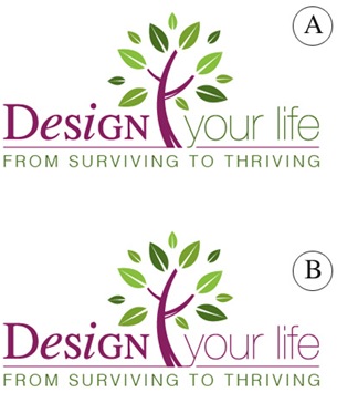
Above you’ll see 2 color combinations
Which do you prefer?
- A
- B
Tag Lines


Above you’ll see 2 tag lines in addition to the topmost one.
Which do you prefer?
- From Surviving To Thriving
- Your New Life Starts Here
- The New You Starts Here
Please leave your feedback as a comment.
And thank you – I very much appreciate your time and thought. 🙂
![]()


Here’s my vote:
Color: Option B seems more symmetrical
Tagline : The New You Starts Here
Also, thanks for letting us give our input into your logo and tagline. I think some of the world’s best ideas are generated this way! 🙂
I like colour B and the From surviving to thriving, because usually when people ask me how im doing, the standard answer is Surviving! Wont they get a shock once your programme has changed my life and they get an “Im thriving” response?
I like colour B and the From surviving to thriving, because usually when people ask me how im doing, the standard answer is Surviving! Wont they get a shock once your programme has changed my life and they get an “Im thriving” response?
colour set B is good,but the your life needs to stand out more it doesnt capture enough.and surviving to thriving captures the feeling of what we all want, to thrive in our own little worlds.
colour set B is good,but the your life needs to stand out more it doesnt capture enough.and surviving to thriving captures the feeling of what we all want, to thrive in our own little worlds.
A
From Surviving to Thriving – many of us are surviving when we’d rather be thriving
A
From Surviving to Thriving – many of us are surviving when we’d rather be thriving
Hi Michele
I like the changing colors in A that make the word “design” more powerful and the third tagline because ” new you” means a deep change.
Best wishes
Hi Michele
I like the changing colors in A that make the word “design” more powerful and the third tagline because ” new you” means a deep change.
Best wishes
My preference in terms of color is option A — I like the symbolism of the colors connecting to the truck & leaves of the tree.
As to the tagline — definitely prefer “The New You Starts Here”. Whatever we’ve experienced up until now has brought us to this new point. The New You Starts Here feels like a “life re-set”. We’re “clearing the decks” and starting fresh.
Thanks for this great new tool and best of luck!
I like the A option of colors and “From Surviving To Thriving”
I like the A option of colors and “From Surviving To Thriving”
I like B with the purple continued from DESIGN. I think it makes the connection to the fact that you are offering to ‘design’ the clients life clearer. Then the tag line is a different colour which shows that that is a further benefit.
Then I much prefer the tagline ‘from surviving to thriving’. With the other two tags,I find the implication that I want or need a ‘new life’ hard. My life is not that awful, it just needs some tweaks which a program like your one would give it. I often feel that I am merely surviving and thus the attraction to move to a position where I might thrive, is great.
Good luck with it. I do love the tree and all that it’s use represents.
A and A.
The colour combo is a bit more energetic and it draws more attention to “your life”, which is, after all, what you’ll be redesigning.
For the tagline, ‘new life’ is too repetitive given the ‘life’ in the main title, and ‘new you’? I don’t think it quite suits. It shouldn’t be about changing ‘you’. It’s about reorganising your life to better suit ‘you’. Hence, I choose from thriving to surviving, which is also nice on the ears.
I like color combo B the best. I think A doesn’t have quite enough purple.
For the tagline, I like From Surviving To Thriving best. There is a reason.
The “new life” and “new you” seems harder to accomplish than MOVING UP from surviving to thriving, which I can relate to more easily. I do like all of the choices though. I can’t wait for the info! I am really making progress getting organized but I really need to get more done!
I like B and 1.
I think thriving is a great word, it certainly isn’t mediocre. Here is the quick definition from dictionary.com:
1. to prosper; be fortunate or successful.
2. to grow or develop vigorously; flourish:
I could deal with either of those!