UPDATE: The competition is now closed.
Check out the Design Your Life logo and winners here!
You may know that we’re releasing the 12-month Design Your Life Program very soon.
This will be our most comprehensive program so far. It’s based on the popular Life & Goal Organizer DIY system, but I’ve chunked it down and made it accountability-based with monthly workbooks, weekly e-classes, action plans, accountability checks and exclusive member forums.
We’re now finalizing the logo, and want to choose something that resonates with you – our readers and customers.
Would you please take a look?
I’ll pick one commenter to receive an entire 12-month Design Your Life membership as a prize.
Colors
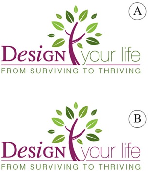
Above you’ll see 2 color combinations
Which do you prefer?
- A
- B
Tag Lines


Above you’ll see 2 tag lines in addition to the topmost one.
Which do you prefer?
- From Surviving To Thriving
- Your New Life Starts Here
- The New You Starts Here
Please leave your feedback as a comment.
And thank you – I very much appreciate your time and thought. 🙂
![]()


I like B and 1.
I think thriving is a great word, it certainly isn’t mediocre. Here is the quick definition from dictionary.com:
1. to prosper; be fortunate or successful.
2. to grow or develop vigorously; flourish:
I could deal with either of those!
Both are great, but I really like the purple logo…choice B.
Your New Life Starts Here caught my eye for the tagline.
Both are great, but I really like the purple logo…choice B.
Your New Life Starts Here caught my eye for the tagline.
I like logo A and “Your new life starts here” I think would be more inviting and energizing to new clients. I love the tree – it jumps off the page and had me thinking of tag lines like “Burst into Life” or Plant the Seed.
How to Survive and Thrive is a tag line for a Relationship and Life Coaching Company in America and I would associate it with that.
Love the colours (I used to use them) and clean style.
Joan Bell
Hi
I prefer colour option B best – continuity of header being one colour and tagline another.
I like both tagline’s, as they both suggest progress within one’s ability to create and achieve. However, I do prefer the tagline “from surviving to thriving” because it encompases how without a “design for life” we as individuals ( friends, family, colleagues) can be simply live to survive, rather than thriving from working towards & achieving our own goals.
I prefer B with From Surviving to Thriving. It feels more cohesive with the top line all one text color. It also makes the tagline stand out more by not matching the top.
One other option that’s not on the table yet is to break up the color on the top line like you did on A, make the tagline be a bit brighter green so it jumps out more. Then it would be really cool because it says Your Life on the top line, then bottom line says From Surviving to Thriving.
To me, those are the three concepts you want to have pop out “Design” “Your Life” (I find it redundant with you, your, or your life in the tagline as well as the top line)and “From Surviving to Thriving.” That’s memorable when you separate it out or put it together “Design Your Life: From Surviving to Thriving” Makes sense? If not, email me 🙂 Nice job
Hello
My preference is Colour B, flows well, and visually balanced.
The tag I prefer is from Surviving to Thriving, my office situation is I seem to bounce from one project to the other and unable to make progress.
Kind Regards
Hello
My preference is Colour B, flows well, and visually balanced.
The tag I prefer is from Surviving to Thriving, my office situation is I seem to bounce from one project to the other and unable to make progress.
Kind Regards
I prefer color scheme A best. It’s all about nuances when reaching people. Green leaves represent new life, vibrant health and balance within which is a fabulous symbolic connection to make with the words ‘your life’ in your logo! That’s exactly what you are helping people create in their lives.
My favorite tag line is ‘The New You Starts Here” because change begins with the self – “You’ – I want to change me first and then my life will flow from there. It’s also short and catchy. ‘From Surviving to Thriving’ is a bit of a tongue twister and holds a lower vibration. It is also very used in regards to breast cancer ‘survivors’ – not sure you want to make that connection.
Here’s to enjoying the creative process!!
Blessings, Kiernan
I like A color on tag 1. And the B logo on tag 2…
I like A color on tag 1. And the B logo on tag 2…
I like the “b” color and the “from surviving to thriving” That’s the key of an organizational make over!!! A new life makes me feel that my “old life” was flawed and bad and that’s not a good personal image. Thank You!!
Becky
I like the “b” color and the “from surviving to thriving” That’s the key of an organizational make over!!! A new life makes me feel that my “old life” was flawed and bad and that’s not a good personal image. Thank You!!
Becky
I prefer the B color scheme because the phrase isn’t broken up by 2 different colors. However, it took me a while to even see the difference.
I definitely prefer ‘Your New Life Starts Here’. ‘From Surviving to Thriving’ sounds clinical and boring to me. ‘New You’ sounds kind of tacky.
A ‘New Life’ is what we’re really looking for, right?
The overall colors and design are really nice.
I like design A with “Your new life starts here”
I’m not keen on the words “from surviving to thriving” – it sounds a bit too heavy and victim-y to me. Having used your ebook, I think you are much more practical than that. Also, the idea of a “new you” is a bit of a personal bugbear for me, as it suggests existing deep-rooted personal flaws (as opposed to practical problems which can be overcome by new habits and systems).