UPDATE: The competition is now closed.
Check out the Design Your Life logo and winners here!
You may know that we’re releasing the 12-month Design Your Life Program very soon.
This will be our most comprehensive program so far. It’s based on the popular Life & Goal Organizer DIY system, but I’ve chunked it down and made it accountability-based with monthly workbooks, weekly e-classes, action plans, accountability checks and exclusive member forums.
We’re now finalizing the logo, and want to choose something that resonates with you – our readers and customers.
Would you please take a look?
I’ll pick one commenter to receive an entire 12-month Design Your Life membership as a prize.
Colors
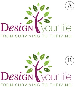
Above you’ll see 2 color combinations
Which do you prefer?
- A
- B
Tag Lines


Above you’ll see 2 tag lines in addition to the topmost one.
Which do you prefer?
- From Surviving To Thriving
- Your New Life Starts Here
- The New You Starts Here
Please leave your feedback as a comment.
And thank you – I very much appreciate your time and thought. 🙂
![]()


I like design A with “Your new life starts here”
I’m not keen on the words “from surviving to thriving” – it sounds a bit too heavy and victim-y to me. Having used your ebook, I think you are much more practical than that. Also, the idea of a “new you” is a bit of a personal bugbear for me, as it suggests existing deep-rooted personal flaws (as opposed to practical problems which can be overcome by new habits and systems).
Colour combination A is definately more appealing. It gives a sensation that life will be calmer afterwards. It sends out a really strong message.
Tagline – “from surviving to thriving” is fabulous, and it goes so well with the image, and the colour scheme A, as the whole message is about transition then, and it gives an impression that it will be a seamless, smooth and painless process.
I’m really excited to hear more about the programme soon!!!
Good luck with it all Michelle. I wish you every success.
For color, I prefer option B. For tagline, I prefer “Your new life starts here”. Love the overall design…can’t wait for the release!!
For color, I prefer option B. For tagline, I prefer “Your new life starts here”. Love the overall design…can’t wait for the release!!
Colors: prefer b
slogan: prefer 2
I love the design! Good job…
geri
goodnewsnetwork.org
Colors: prefer b
slogan: prefer 2
I love the design! Good job…
geri
goodnewsnetwork.org
B flows better, less interupted
Prefer #2 as a tagline, but my mind is buzzing with options 4, 5, 6, 7, etc.
B flows better, less interupted
Prefer #2 as a tagline, but my mind is buzzing with options 4, 5, 6, 7, etc.
Masthead design ‘B’ does it for me. Colors are quite applicable to ‘new beginnings’ — purple for regalia and green for earth/life/happiness.
Tag line ‘2’ delivers a double knock out to your potential client because the word ‘life’ is used twice, both in tag and company name. Therefore the illustration to new life is created without necessarily portraying a victim perspective. Also, the double use of the word LIFE illustrates the overall PURPOSE of the 12-month program in a contemporary way…”kick the old you to the curb and say hello to the new you– right now!”
That’s my two-cents worth. Happy to help.
I AM (still)– “Going toward my destiny!”
–Debra J. Gordon (Tallahassee, Fla USA)
Hi and first of all thanks for your invitation to be your friend.
You got a lot of great comments here. My gut feeling right away was:
Design A because the green of Your Life to me denotes change, growth and feeling alive.
I loved “from surviving to thriving” it really makes the reader realize and feel where they are at and that they can thrive, i.e. be all that they can be and more.
Awesome! and thanks for asking for my opinion.
Wishing you much success and blessings,
Ann
I am 100% support version A – design – it is very subtle – but enough to feel more welcome – the colour or hue – is just a bit brighter – and that on a vibrational level – hit me more on a positive note.
Now with the tag line – I with out a doubt from “From Surviving To Thriving” – it tells me exactly what your systems will do for me – I don’t have to wonder – and where as the other two – I am not sure – suppose- I like the ‘old me’ – it assumes that their is something wrong with ‘me’ – rather – than I need to make a change in my habits and/or behaviours to have a better life – to ‘thrive’.
Blessings,
Ophelia – Spiritual Life Coach.
Hi, Michele,
Hands down, I prefer Logo A, although ‘your life’ doesn’t stand out- I’d like to see it a little more bold so it stands out as much as the word Design. Love the green contrast with the purple – they are very soothing and calming colors (a lot like my own color scheme)!
For the tag line, I like ‘Your New Life Starts Here’ although it is somewhat vague and doesn’t give me a feeling of needing it because at first glance of the logo and tagline I don’t really know what this is- a product? a program? I’m also not crazy about the font and being in caps – I think it would look better in another font maybe with italics for emphasis.
Your products are great- I really enjoy the freebies you’ve so graciously given out! I’m a total neat-freak organizer and even I find your checklists to be extremely helpful!
Good luck- looks like you’ve got a lot of comments to take into consideration! 🙂
Warmly,
Angie Wycoff
For Colors I prefer A. I love purple so the more the merrier.
For the Tag Line, sorry I’m not in love with any of them. I’d prefer something like The Journey Begins Here or Your Journey Begins Here. Surviving etc can be a tongue twister and both of the others (New Life, New You) sound like other tags/logos I’ve heard before. I think your design is beautiful and should be more unique.
Thank you! I hope this helps!!!
crystal
Hi Michele
I like the purple and green logo (A) and the tag line: Your new life starts here. Its very positive and something to look forward to.
Cecelia