UPDATE: The competition is now closed.
Check out the Design Your Life logo and winners here!
You may know that we’re releasing the 12-month Design Your Life Program very soon.
This will be our most comprehensive program so far. It’s based on the popular Life & Goal Organizer DIY system, but I’ve chunked it down and made it accountability-based with monthly workbooks, weekly e-classes, action plans, accountability checks and exclusive member forums.
We’re now finalizing the logo, and want to choose something that resonates with you – our readers and customers.
Would you please take a look?
I’ll pick one commenter to receive an entire 12-month Design Your Life membership as a prize.
Colors
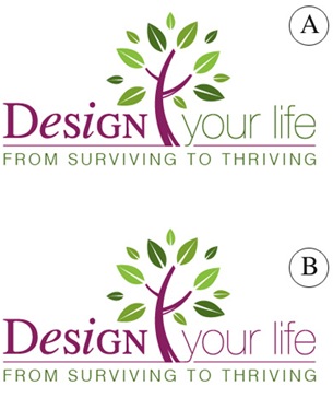
Above you’ll see 2 color combinations
Which do you prefer?
- A
- B
Tag Lines


Above you’ll see 2 tag lines in addition to the topmost one.
Which do you prefer?
- From Surviving To Thriving
- Your New Life Starts Here
- The New You Starts Here
Please leave your feedback as a comment.
And thank you – I very much appreciate your time and thought. 🙂
![]()


Hi Michele
I like the purple and green logo (A) and the tag line: Your new life starts here. Its very positive and something to look forward to.
Cecelia
Colours – I liked B…I think it flows better
Tag line – From Surviving to Thriving…to me this means really changing your habits and life in a very positive way
Colours – I liked B…I think it flows better
Tag line – From Surviving to Thriving…to me this means really changing your habits and life in a very positive way
B
The new you starts here. This tagline immediately evoked a vision of a different and successful person!
B
The new you starts here. This tagline immediately evoked a vision of a different and successful person!
It took me a while to see the difference, but I think B is best, because the design refers to your life.
Definitely “from surviving to thriving” – at least, that’s what getting organised is all about for me.
It took me a while to see the difference, but I think B is best, because the design refers to your life.
Definitely “from surviving to thriving” – at least, that’s what getting organised is all about for me.
I like B and from thriving to surviving
I like B and from thriving to surviving
I prefer colour combination B, as well as “From Surviving To Thriving ” – it puts focus on effectiveness and organization, rather than on making a drastic change to our habits, which could deter some people.
I prefer colour combination B, as well as “From Surviving To Thriving ” – it puts focus on effectiveness and organization, rather than on making a drastic change to our habits, which could deter some people.
Re. colors, I like A. Somehow it seems a bit bolder and brighter. As I look again, I think it’s due to the contrast of colors. The green on “Your Life” jumped out at me.
Re. tag lines, I like “From Surviving to Thriving”. It feels more concrete to me. I have a better sense of how this book will help me in my life. To me, “a new you” or “your new life” seems more nebulous.
Also, I think it’s redundant to use “your” twice; your life, then your new life. Better to use a different word the second time.
Blessings…
Hi Michele – I really like colour choice A as it has a good energy to it and “From Surviving to Thriving” really hits the mark with me because that is similar to my tag line – “Teaching Parenting Skills to Help Families Thrive Not Just Survive – heck, my colours are even similar to yours! Funny!
All the best, I love the energy in your posts and the valuable, specific techniques you give.
SIncerely,
Erin Kurt
B is my choice. I love them all but I like the colors in B and the tagline as well.
B is my choice. I love them all but I like the colors in B and the tagline as well.
Michele, whatever you decide on your designs are great! I am one for experiences so I tend towards B, just a little more pleasing on the eye and I agree with Cam and a few others that ‘you’ or ‘your’ is important so would go with ‘your new life starts here’
Best wishes
Anne
Michele, whatever you decide on your designs are great! I am one for experiences so I tend towards B, just a little more pleasing on the eye and I agree with Cam and a few others that ‘you’ or ‘your’ is important so would go with ‘your new life starts here’
Best wishes
Anne
Hi Michele I think the colours in A are well balanced and with 25 years in publishing i would go with “your new life” as it gives the client ownership. But at the end of the day which logo are YOU most passionate about?
As this will be the one that empowers the most!
Good luck.