UPDATE: The competition is now closed.
Check out the Design Your Life logo and winners here!
You may know that we’re releasing the 12-month Design Your Life Program very soon.
This will be our most comprehensive program so far. It’s based on the popular Life & Goal Organizer DIY system, but I’ve chunked it down and made it accountability-based with monthly workbooks, weekly e-classes, action plans, accountability checks and exclusive member forums.
We’re now finalizing the logo, and want to choose something that resonates with you – our readers and customers.
Would you please take a look?
I’ll pick one commenter to receive an entire 12-month Design Your Life membership as a prize.
Colors
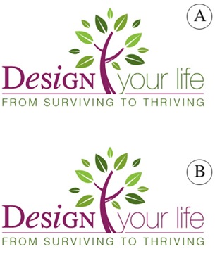
Above you’ll see 2 color combinations
Which do you prefer?
- A
- B
Tag Lines


Above you’ll see 2 tag lines in addition to the topmost one.
Which do you prefer?
- From Surviving To Thriving
- Your New Life Starts Here
- The New You Starts Here
Please leave your feedback as a comment.
And thank you – I very much appreciate your time and thought. 🙂
![]()


I agree – A is best for colour and I personally prefer Your New Life Starts Here as “thriving” is not good enough for me either! (And I am the type who tends to change everything all at once, although I know not everyone is like that!)
Having said that (and I know it would mess up the design, or might) I think a more powwrful energy-rich word in between “Your” and “New” could be just what it needs and could tie in with the tree logo.
So something like Your Abundant New Life Starts Here or Your Beautiful New Life Starts Here.
Hope this helps! Can’t wait to see it!
I like the B colour design better – it’s easier on the eye, and the flow of the colours is better. The logo is “Design Your Life” – with the change in colour for A, I find that I don’t think the “Your Life” part is actually included in the name.
I like the tag line “The New You Starts Here” best. Agree with comments re a bit of negativity re surviving to thriving, but also agree it suits current climate. Your new life starts here – sounds like a complete overhaul, and good for those who really need the complete change. However The new you starts here – appears to me like you’re taking the best bits of yourself, and building upon them, to make a better you.
wow, you’ve got a lot of comments!
re colour choice, i have no particular preference – they both look great
re tag lines, i defintely prefer ‘from surviving to thriving’
good luck!!!
wow, you’ve got a lot of comments!
re colour choice, i have no particular preference – they both look great
re tag lines, i defintely prefer ‘from surviving to thriving’
good luck!!!
Michelle,
I know this may be a little left-field, however, I just recently read an artice on Feng Shui and Colour selection. Your two shoices were quite interesting and I have to admit that choice B is favourable to me. Why? Well, according to Feng Shui, purple is represented as fire, what this means in this logo is that fire=passion, that is the passion to change your life. It also should be interpreted in Northeast/Southwest direction which generates the most energy for your space. So in saying that, it gives me the impression of vitality and energy focus in my life.
Finally the colour green at the bottom represents Health and Vitality in Feng Shui, perfect for the tagline – From Striving to Thriving….I think that answers your question – Colour B with tagline 1!!!
Hope not too convoluted!
Hi Michele,
I like A the best- love the colours and by-line “From surviving to thriving” will draw people in who are looking to change their lives in a dramatic way.
Hi Michele,
I like A the best- love the colours and by-line “From surviving to thriving” will draw people in who are looking to change their lives in a dramatic way.
I like color choice A. Nice flow and it fits w/newness. I also like the tagline, “From surviving to thriving.” Much more interesting and spicy. The other two are so trite and boring.
I like color choice A. Nice flow and it fits w/newness. I also like the tagline, “From surviving to thriving.” Much more interesting and spicy. The other two are so trite and boring.
I like colour choice A (green) as I think this works better with the colours in the tree and the tag line. In terms of the tag line, I like ‘From surviving to thriving’ – very catchy!
I like colour choice A (green) as I think this works better with the colours in the tree and the tag line. In terms of the tag line, I like ‘From surviving to thriving’ – very catchy!
I prefer A – We are on a path to greener, and the flow seems natural in A. To me it enhances the message
From Surviving to Thriving – A world where we have been conditioned, it is time that we take control of our lives and it is great to see so many people doing this and “Thriving”.
No longer is “The Man” in control.
It took me a while to see the difference in the colours- both look great.
From Surviving To Thriving is far superior to the other two tag lines I think 🙂
It took me a while to see the difference in the colours- both look great.
From Surviving To Thriving is far superior to the other two tag lines I think 🙂
Keeping “Design Your Life” all in one color maintains continuity of thought for your program and provides appealing color symmetry. As a tag line, “Your New Life Starts Here” indicates an ending and more than just a new beginning – there’s a whole new life waiting to be experienced!
Keeping “Design Your Life” all in one color maintains continuity of thought for your program and provides appealing color symmetry. As a tag line, “Your New Life Starts Here” indicates an ending and more than just a new beginning – there’s a whole new life waiting to be experienced!
I like the tagline “Your new life starts here”. Style B. Love the love logo desgin. Great work. Very inspiring 🙂