UPDATE: The competition is now closed.
Check out the Design Your Life logo and winners here!
You may know that we’re releasing the 12-month Design Your Life Program very soon.
This will be our most comprehensive program so far. It’s based on the popular Life & Goal Organizer DIY system, but I’ve chunked it down and made it accountability-based with monthly workbooks, weekly e-classes, action plans, accountability checks and exclusive member forums.
We’re now finalizing the logo, and want to choose something that resonates with you – our readers and customers.
Would you please take a look?
I’ll pick one commenter to receive an entire 12-month Design Your Life membership as a prize.
Colors
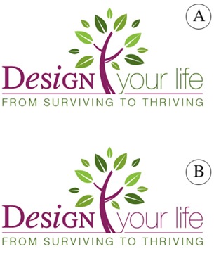
Above you’ll see 2 color combinations
Which do you prefer?
- A
- B
Tag Lines


Above you’ll see 2 tag lines in addition to the topmost one.
Which do you prefer?
- From Surviving To Thriving
- Your New Life Starts Here
- The New You Starts Here
Please leave your feedback as a comment.
And thank you – I very much appreciate your time and thought. 🙂
![]()


I like the “Thriving to Surviving” style B. Great design!
I like the “Thriving to Surviving” style B. Great design!
Colors: prefer ‘A’ because the colors appear more well balanced visually. having more green is ‘A’ more consistent with the theme of new life and a fresh start. (think Spring).
Tag Lines: prefer ‘2’ because “Your New Life Starts Here” conjures up ideas of positive change that the program can bring. I find this rolls off the tongue better than ‘3’ as well. I don’t prefer ‘1’ because to say the status quo is just ‘Surviving’ has negative connotations and implies one is currently struggling and hence is only surviving – it doesn’t bring positive feelings upon reading unlike the other 2 tag lines.
Sorry to Arnette, I was going to quote your comment, but pressed submit before i could add the quote marks and details.
Sorry to Arnette, I was going to quote your comment, but pressed submit before i could add the quote marks and details.
I prefer color combination A (although there in not much difference.)
I passionately prefer “From Surviving to Thriving”! It is VASTLY better than the other two!
Combination A caught my eye more easily, and “From Surviving to Thriving” sounds so much like what Im after.
they look and sound great!!
I prefer color combination A (although there in not much difference.)
I passionately prefer “From Surviving to Thriving”! It is VASTLY better than the other two!
Combination A caught my eye more easily, and “From Surviving to Thriving” sounds so much like what Im after.
they look and sound great!!
While purple is my very favorite color in the whole world, I actually prefer COLOR Choice A. The words “your life” in green make me think of growth and the change in color sets it off more.
TAG LINES: #1 and #2 are both good and it is hard to decide between them. I vote for #2 as “your new life starts here” feels like a call to action…kind of like “click here” makes you want to do something. “Surviving to thriving” sounds good in this economy but may not have as long a life when the economy picks up.
Love the theme overall! Thanks for sharing – this was fun!
I like the B colors better – I think the A looks asymmetrical to me.
I like 1 From Surviving to Thriving…That’s why I visit your site, you give me inspiration to do more than just get through today!
I like the B colors better – I think the A looks asymmetrical to me.
I like 1 From Surviving to Thriving…That’s why I visit your site, you give me inspiration to do more than just get through today!
I like A1. I just let the design part draw my eye. “A” definitely did that over “B”. Surviving to Thriving is a very powerful concept. Most people want more than what they currently have and are.
I like A1. I just let the design part draw my eye. “A” definitely did that over “B”. Surviving to Thriving is a very powerful concept. Most people want more than what they currently have and are.
I love the new design A.
I can’t wait until you release the new material.
Keep up the good work and have fun downunder!
Terry
I love the new design A.
I can’t wait until you release the new material.
Keep up the good work and have fun downunder!
Terry
Hi!!
I like colours B best and the tag line The New You Starts Here.
All the best D.
Hi!!
I like colours B best and the tag line The New You Starts Here.
All the best D.
Color choice A grabs me more.
“From Surviving to Thriving” gets me on a visceral level. It’s not as ‘polite’ as the others. People who will need the program (I think) will identify with this.
Color choice A grabs me more.
“From Surviving to Thriving” gets me on a visceral level. It’s not as ‘polite’ as the others. People who will need the program (I think) will identify with this.