UPDATE: The competition is now closed.
Check out the Design Your Life logo and winners here!
You may know that we’re releasing the 12-month Design Your Life Program very soon.
This will be our most comprehensive program so far. It’s based on the popular Life & Goal Organizer DIY system, but I’ve chunked it down and made it accountability-based with monthly workbooks, weekly e-classes, action plans, accountability checks and exclusive member forums.
We’re now finalizing the logo, and want to choose something that resonates with you – our readers and customers.
Would you please take a look?
I’ll pick one commenter to receive an entire 12-month Design Your Life membership as a prize.
Colors
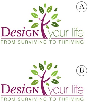
Above you’ll see 2 color combinations
Which do you prefer?
- A
- B
Tag Lines


Above you’ll see 2 tag lines in addition to the topmost one.
Which do you prefer?
- From Surviving To Thriving
- Your New Life Starts Here
- The New You Starts Here
Please leave your feedback as a comment.
And thank you – I very much appreciate your time and thought. 🙂
![]()


I prefer color B, seems more streamlined. I (like many others, it seems) prefer the “Surviving to Thriving” tagline. To me it seems more like an improvement on what you’ve got, which we’re all looking for. Whereas, the “new life” or “new you” seems more like a need to fix or replace something which makes you feel somethings wrong with you. I’m probably over-analyzing on that last bit, but it’s just my opinion.
I prefer A – I like the green more.
From surviving to thriving – how many of us just survive through another day, week, month or year – how much better to thrive!
I prefer A – I like the green more.
From surviving to thriving – how many of us just survive through another day, week, month or year – how much better to thrive!
UPDATE: The competition is now closed.
Check out the Design Your Life logo and winners here:
http://www.getorganizedwizard.com/blog/2009/10/announcing-the-design-your-life-logo-winners/
Thanks for the wonderful feedback!
M 🙂
UPDATE: The competition is now closed.
Check out the Design Your Life logo and winners here:
http://www.getorganizedwizard.com/blog/2009/10/announcing-the-design-your-life-logo-winners/
Thanks for the wonderful feedback!
M 🙂
I like the color combination B. The continuity of color seems calmer and more balanced which is what the program can provide. I also like the 1st tag line. For me, that’s what it is all about. I am merely surving right now, just barely holding my head above water. I don’t want a new life, I want my life. I just want to thrive in all areas of MY life.
Thanks fo the opportunity.
Michelle
I think I like the “A” design and the tagline Your New Life Starts Here.
I think I like the “A” design and the tagline Your New Life Starts Here.
I prefer “From Surviving to Thriving” and the A. I like A because it shows a change as the letters go through the design. I also like the last part being in green as green is indicative of a green, living, thriving plant. I like the words Surviving to Thriving as that is where a lot of people are – just surviving. With your hints and advice we can move on to thriving as we design our lives to be less cluttered and more efficiently run.
I prefer “From Surviving to Thriving” and the A. I like A because it shows a change as the letters go through the design. I also like the last part being in green as green is indicative of a green, living, thriving plant. I like the words Surviving to Thriving as that is where a lot of people are – just surviving. With your hints and advice we can move on to thriving as we design our lives to be less cluttered and more efficiently run.
Hi Michelle
I like colour combination A because through a change in colour from purple to green, it represents a distinct evolution from the current state to the intended future state. Green is also the colour for go, and reflects the colour of grass, nature and ecology.
This aligns with my favourite tagline of “from surviving to thriving” which again implies a positive metamorphosis from one state to another. When I read this tagline I immediately feel a sense of relief that this offers a solution for me, and is something I want to check out further. I am “called to action”. That I could thrive even though I am currently just surviving amidst a busy life with fours busy gorgeous boys.
I can’t wait to read more about your exciting programme and how I can shift from surviving to thriving…
Love & laughter
Kara