UPDATE: The competition is now closed.
Check out the Design Your Life logo and winners here!
You may know that we’re releasing the 12-month Design Your Life Program very soon.
This will be our most comprehensive program so far. It’s based on the popular Life & Goal Organizer DIY system, but I’ve chunked it down and made it accountability-based with monthly workbooks, weekly e-classes, action plans, accountability checks and exclusive member forums.
We’re now finalizing the logo, and want to choose something that resonates with you – our readers and customers.
Would you please take a look?
I’ll pick one commenter to receive an entire 12-month Design Your Life membership as a prize.
Colors
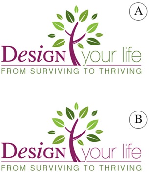
Above you’ll see 2 color combinations
Which do you prefer?
- A
- B
Tag Lines


Above you’ll see 2 tag lines in addition to the topmost one.
Which do you prefer?
- From Surviving To Thriving
- Your New Life Starts Here
- The New You Starts Here
Please leave your feedback as a comment.
And thank you – I very much appreciate your time and thought. 🙂
![]()


Hi Michele,
My vote is for the color combo B because the continuity in the color goes with the phrase.. wouldn’t want to break the phrase by changing colors.
I like the tag line #1 From Surviving to Thriving because I think it really captures how people feel, that they are just surviving in current mode of operation. I prefer that over creating something new for a couple of reasons: NEW sounds like TOO MUCH WORK and like starting over. We can capitalize on our strengths and experiences as we work to better ourselves and create the life want. We all want to THRIVE!
I appreciate your expertise. You have really motivated me! I hope that I win the prize! I know it will be valuable to anyone using it!
I like “your new life starts here.” The design is similar enough so that you can choose any of them and not go wrong. assuming you also work with people who are not just surviving but thriving and yet not thriving to the extent they want to be. Lorrie
I like “your new life starts here.” The design is similar enough so that you can choose any of them and not go wrong. assuming you also work with people who are not just surviving but thriving and yet not thriving to the extent they want to be. Lorrie
color B
tag line #2 new you starts here
but they all look good!
Elizabeth Harris
color B
tag line #2 new you starts here
but they all look good!
Elizabeth Harris
A & A. For some reason (colors I believe) gets your attention and the tag line speaks to where alot of people are and want to be. It’s beautiful
A & A. For some reason (colors I believe) gets your attention and the tag line speaks to where alot of people are and want to be. It’s beautiful
Hi Michele
I agree and join the group of Suzie,Jennifer,Kelly,Sarah,Geri,David, Debra… but specially Diana’s remark I agree with the most. Good Luck!
Color combo: B all purple “Design Your Life” (all in same font)
Slogan : “Your Transformed Life Starts Here”
Keep up the great work Michele 😉
Hi Michele
I agree and join the group of Suzie,Jennifer,Kelly,Sarah,Geri,David, Debra… but specially Diana’s remark I agree with the most. Good Luck!
Color combo: B all purple “Design Your Life” (all in same font)
Slogan : “Your Transformed Life Starts Here”
Keep up the great work Michele 😉
I prefer B for the color. “Design your life” all in one color, it looks more together and flows smoothly. What a great design!
For the tag lines: I absolutely like “The New You Starts Here”. If I win the 12 month “Design Your Life” program, I will still have my old life–my husband, my dog, my job, my friends. But I WILL BE NEW in the old life, with new ideas, new techniques, new management of time, new goals. What a fantastic thought! I really will be thriving instead of just surviving.
Thank you, Michele.
On the colours: I like the slightly more vibrant A. I also found it slightly easier to read.
On the taglines: I prefer From surviving to thriving!
I initially liked “your new life starts here,” but while I was writing my colour comments, I began to feel … broken. It went from a “fresh start” interpretation, to “I’m broken and need repair.” Yes – I need help. But I do feel I am surviving, and perhaps a little more. I want to thrive! But don’t need a whole new start, just a course correction.
Thanks for asking for my input. Great new product, very well done so far. Just what I expect from you.
Elisabeth
They’re all good, but I believe that:
1) A is better because it draws the eye in to focus on the important part.
2) “Your new life starts here” because that’s what the client is searching for (they already understand that they will go from surviving to thriving, but that phrase just reminds them that they’re barely getting by) and the other phrase just focuses on one person, whereas the client may be a person who runs the entire household & needs to re-vamp everything from a-z, in addition to themselves, the person.
Overall, it’s great – that’s just my two cents.
Thanks for all you do & kudos on the new product & logo & tagline!
Best,
Rach
Like design A
Tagline – From Surviving to Thriving
Like design A
Tagline – From Surviving to Thriving
I like design A. I usually like things symetical and balanced, but this choice breaks it up more so you see it all better instead of blending in. I took a quick peek before really looking at them both and I could definitely see Choice A better – it popped more (because it didn’t blend) I suppose some of the comments about “From Surviving to Thriving has negative undertones” is correct, but I still like this line the best as I am definitely only surviving at this point in my life and need to get to the thriving stage, so I like this much better and it gets your attention. Good Luck.
I like design A. I usually like things symetical and balanced, but this choice breaks it up more so you see it all better instead of blending in. I took a quick peek before really looking at them both and I could definitely see Choice A better – it popped more (because it didn’t blend) I suppose some of the comments about “From Surviving to Thriving has negative undertones” is correct, but I still like this line the best as I am definitely only surviving at this point in my life and need to get to the thriving stage, so I like this much better and it gets your attention. Good Luck.
Design B is the way to go. The tree is a good color contrast that ties the taglines together so for marketing purposes you’ll want each line of words to be one color so it just flows and isn’t too busy.
Option 1 is the best choice because it changes things up and doesn’t repeat any words. Also, the 2nd and 3rd choices feel like running from where option one is running to. (ex. running from the stick as opposed to running to the carrot.) I think part of the goal in learning to be organized is the transition one wants to make in going from a stick runner to a carrot go getter.